I started using fountain pens and inks with my watercolor artwork last year and have been searching for lightfast inks on and off for months. Many inks made for artists are either dye-based (not lightfast), pigment-based (not suitable for fountain pens), or are only available in unsuitable colors for my artwork. Pigment-based inks have particles and properties that can clog or even damage fountain pens and many fountain pen inks claiming to be lightfast are only partially so. This is fine if you just want a signature to outlast light or water exposure for legal reasons, but for artwork it’s important for the color to maintain its integrity.
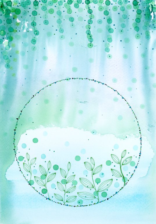
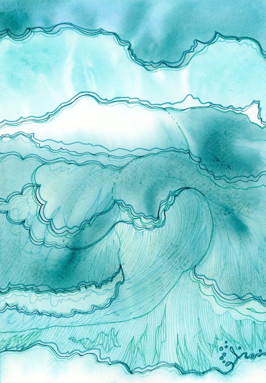
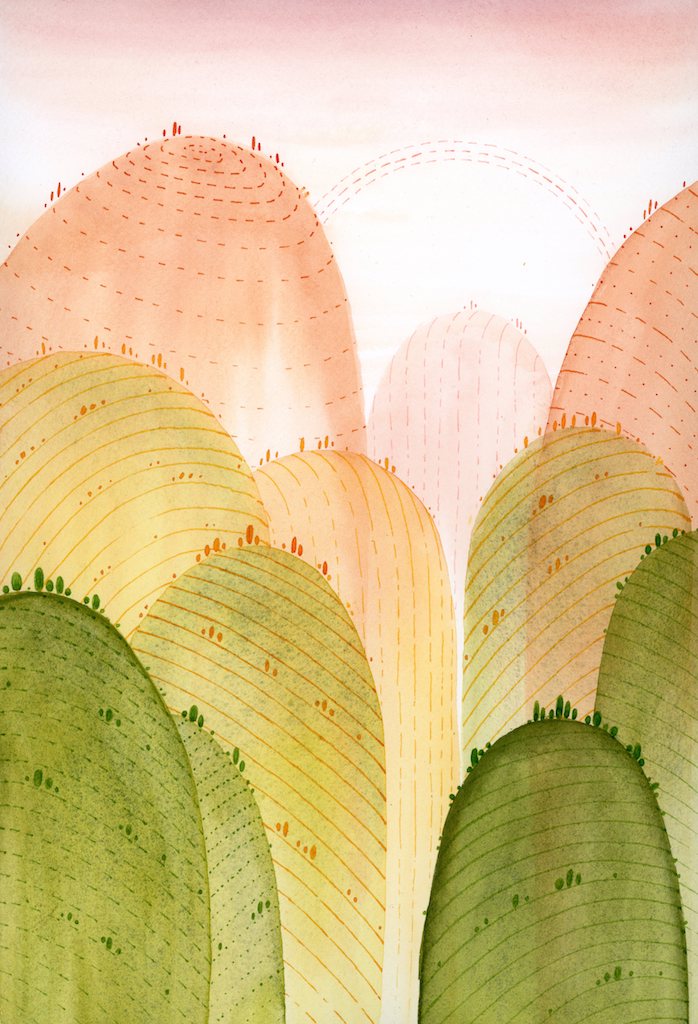
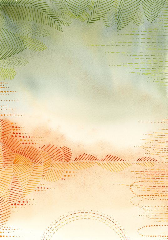
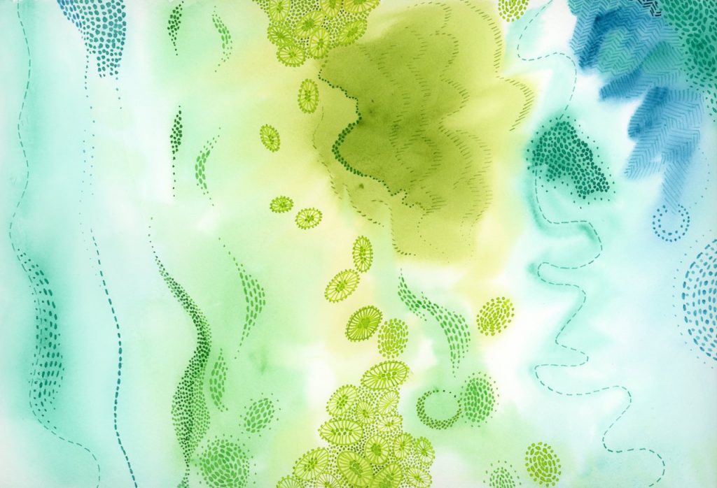
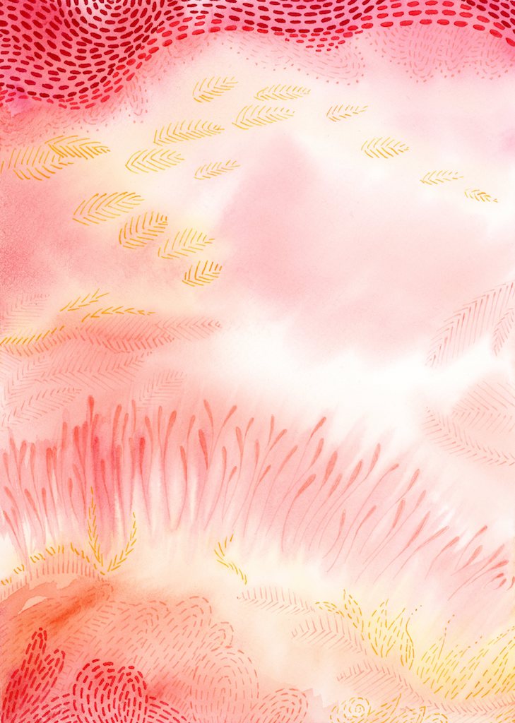
Here are some examples of how I’ve used ink drawing with watercolor. I used fugitive inks that will not withstand sunlight when hung on a wall, and are therefore only suitable for scanning and printing.
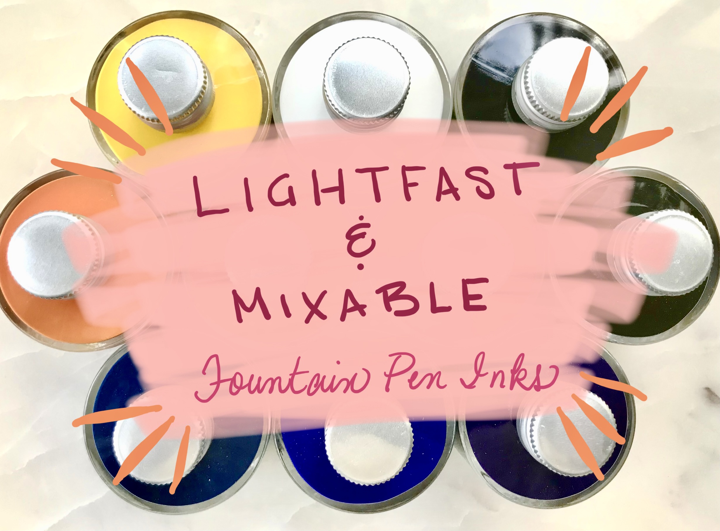
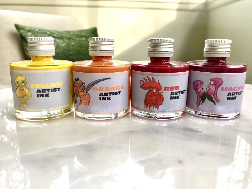
I was also looking for colors that would accentuate the art that I do, yet was only finding a handful of lightfast inks with colors that were too dark, too saturated, or just not in line with my work. Then I found information on De Atramentis Artist Inks (I believe this is the same line of inks formerly titled Document inks, rebranded in Oct 2020). This was a breakthrough for me. I really wanted to be able to use ink in my art (with fountain pens) and have the assurance it can withstand the test of time displayed on a wall.
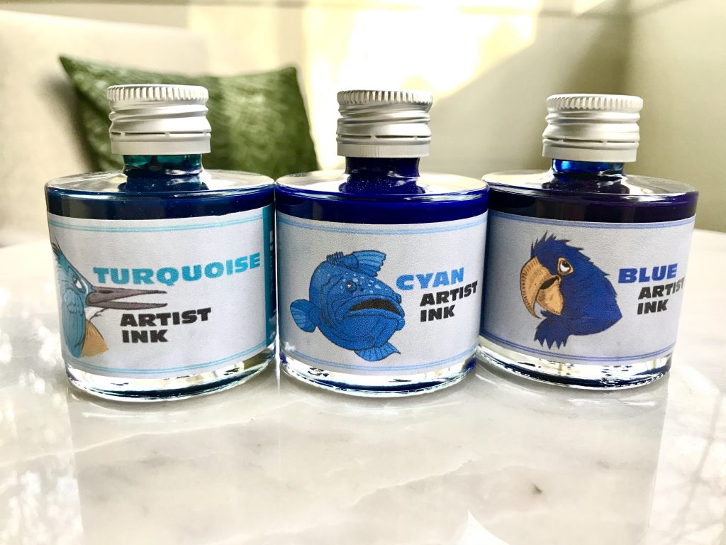
The De Atramentis Artist Ink line is made with nano pigments, making it suitable for fountain pens. It is exceptionally lightfast and comes in an excellent array of colors for mixing. This includes split primaries—cool and warm tones of Cyan, Magenta, and Yellow—as well as convenience colors, such as black, gray, brown, purple, turquoise, and green.
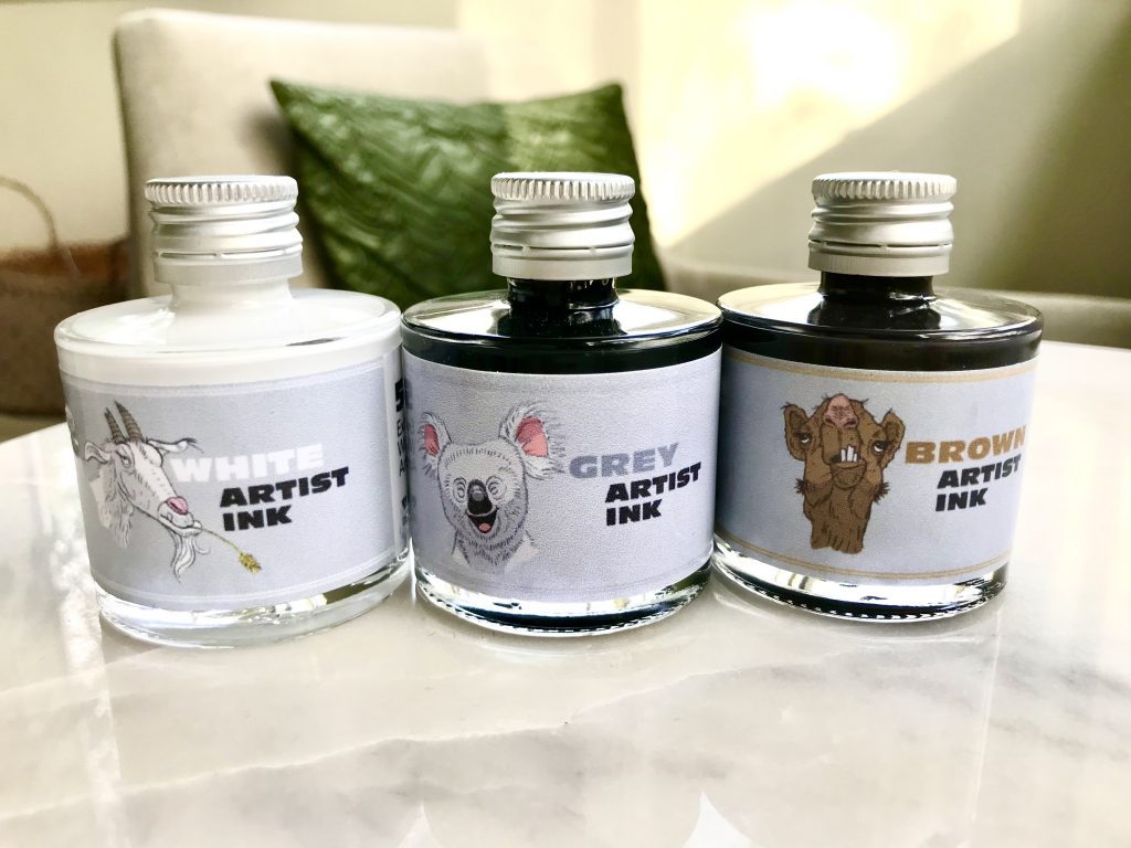
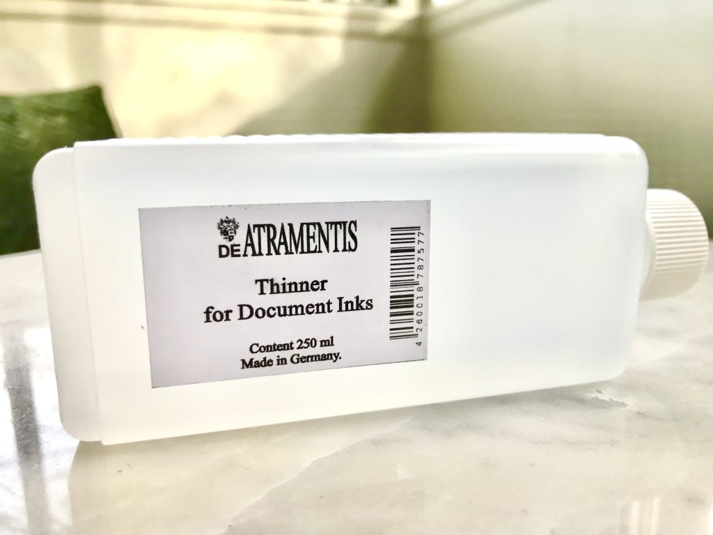
White is also an option, though I’m less clear on how this would be used, mainly because a dilution liquid (or thinner) is available, allowing for the creation of pale colors. It doesn’t seem o be a very opaque white, so I assume it would not work great on darker surfaces. I did purchase the while and will likely experiment with this in the future.
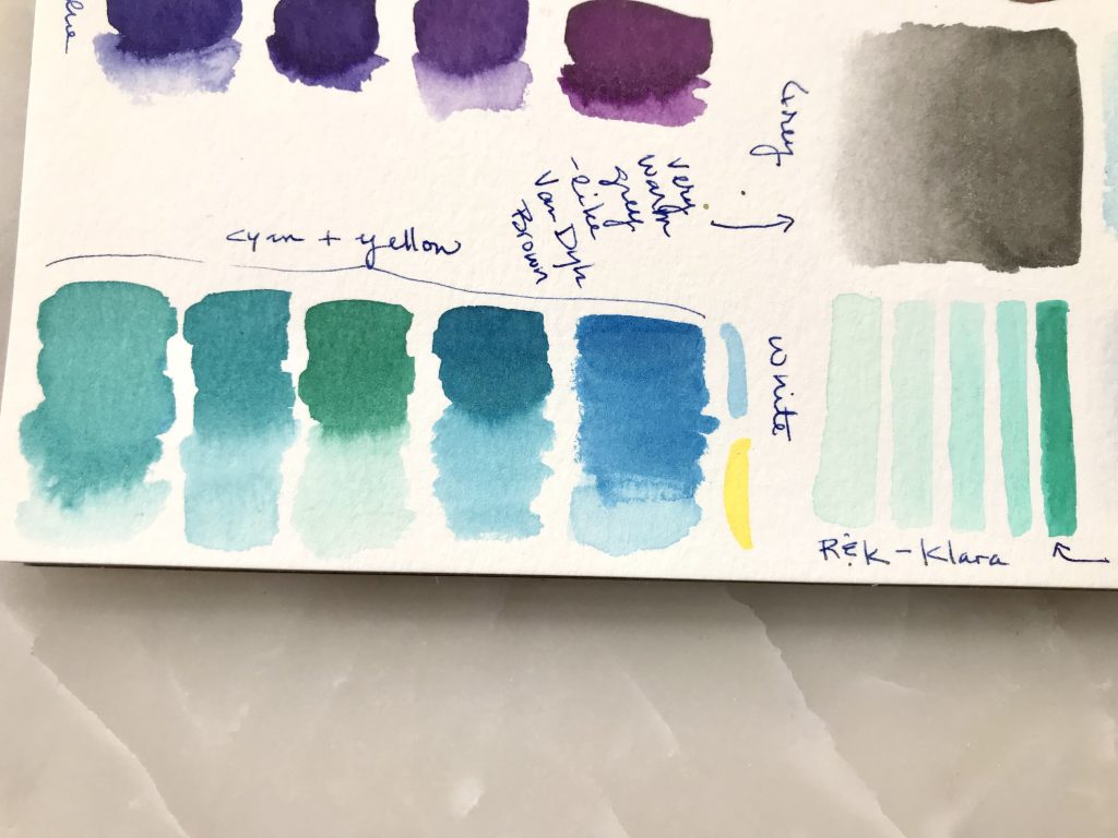
I created swatches of the inks and some general mixes to see how the colors performed. For the most part, the colors are vibrant and mix well, creating beautiful greens, oranges, and deep purples.
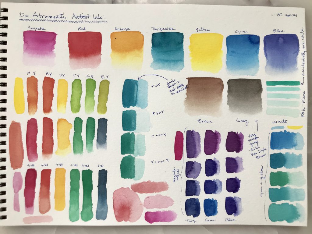
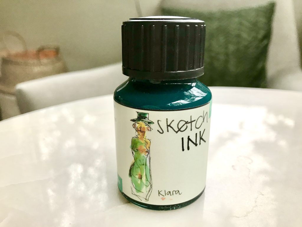
One thing that became apparent was the Turquoise was slightly dull and mixing a vibrant teal, turquoise or aqua was proving difficult. This is an important color to me in my art, so I looked for a solution. What I decided was to augment this set with a color from another line, namely Rhorer & Klingner’s Klara Sketch Ink. It’s not a nano-pigment, but seems to be working fine so far. I will limit my mixes and keep an eye on it for any issues.
This provided me with a more vibrant bluish green, in line with a Phthalo green, an excellent starting point for the additional colors I was looking for. In the image below, you can find five De Atramentis mixes on the left and the more vibrant Klara swatches to the right, including four water-based dilution swatches.
Up next, I will post about all color the mixes I created for pairing with my watercolor art.
More information:
- Jane Blundell shares information on De Atramentis Artist inks and mixes
- Brenda Swenson tests lightfastness of various inks, including De Atramentis Document inks
- Leigh Reyes talks about using De Atramentis Document inks in fountain pens

[…] For more information on these selections, see my other post, Lightfast & Mixable Fountain Pen Ink. […]