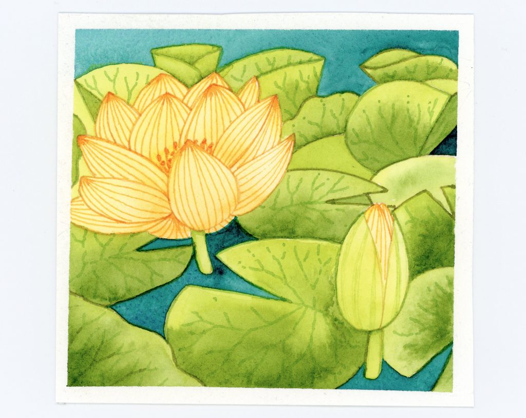
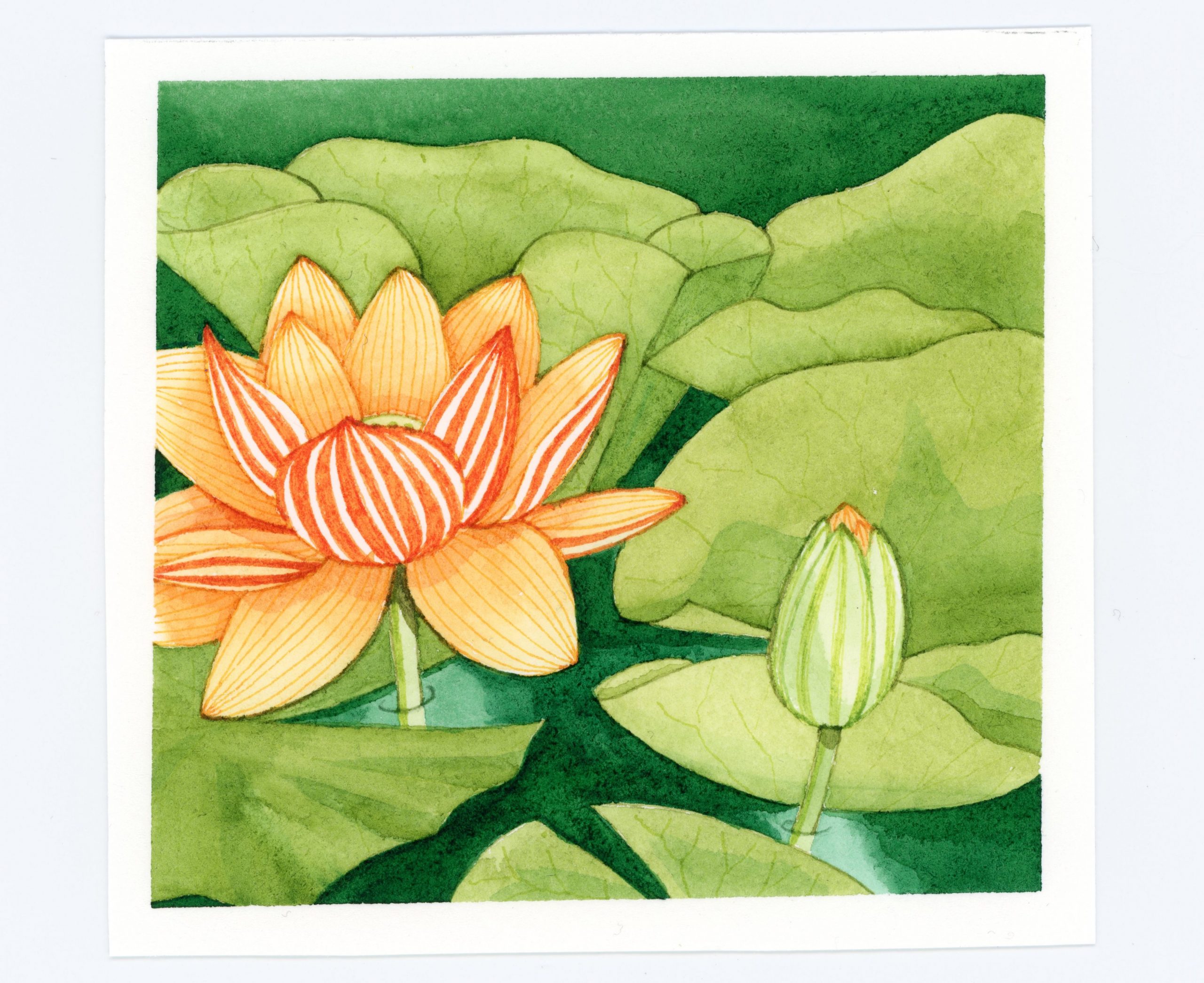
I created a similar design, but wanted to improve on it. This is the revised version and I’m very happy with the result. In this version, I took more care with the proportions and shapes of the waterlily petals. I also added greater differentiation between the inside and outside of the petals with design details. I added more layers of shading, showed the stems in the water, and added a couple reflections in the water. There are other small differences, but those are the main ones.
Here is the previous design for comparison.
