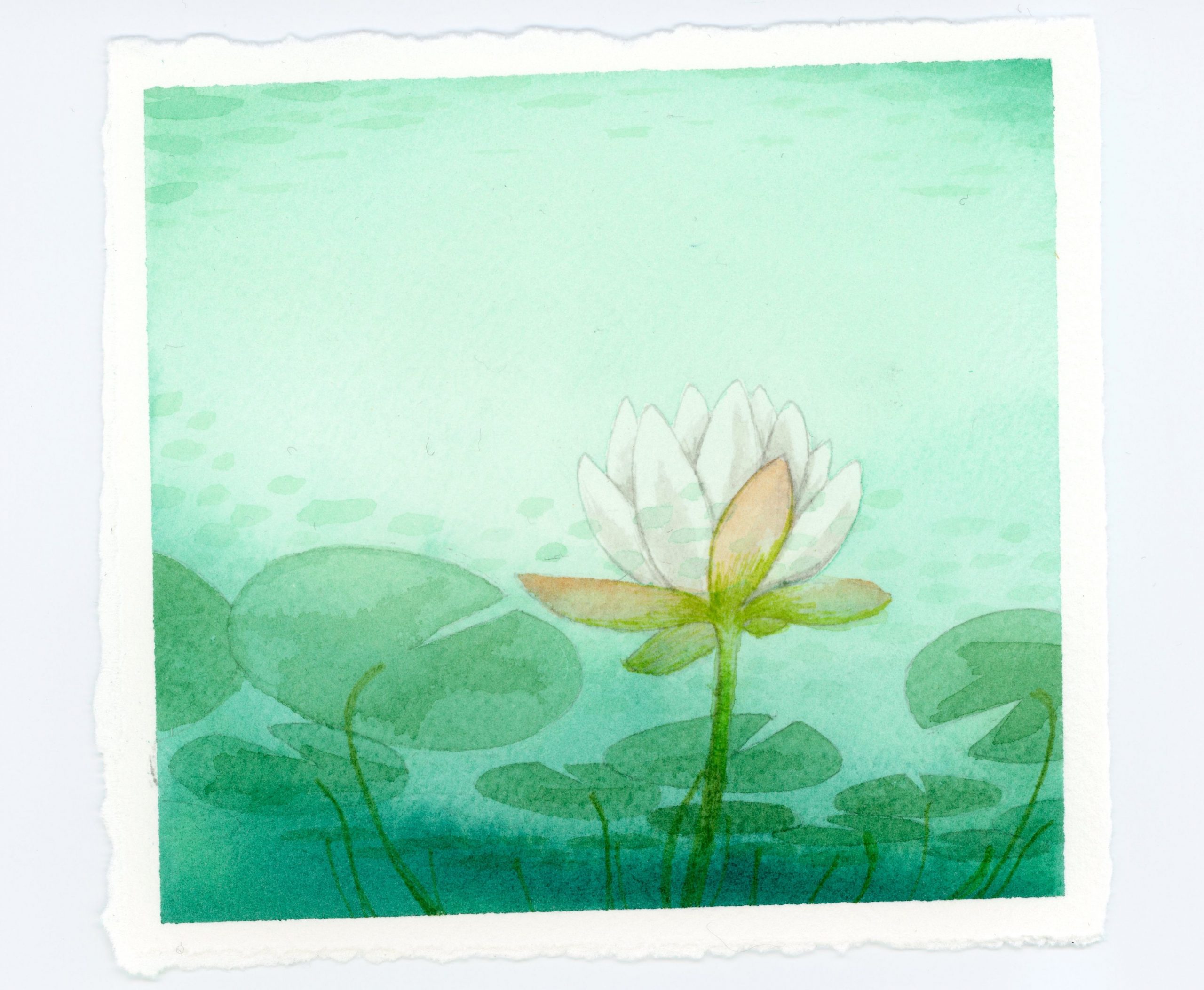
My intent today was to improve on yesterday’s waterlily design. I tried two different masking techniques that did not work out before creating today’s design. The first issue was a sticker I cut out and had trouble removing (right), and the second was masking fluid from a pen applicator that didn’t cover evenly and left splotchy areas (left). Also, the paint nearby was coming off as I rubbed off the masking fluid.
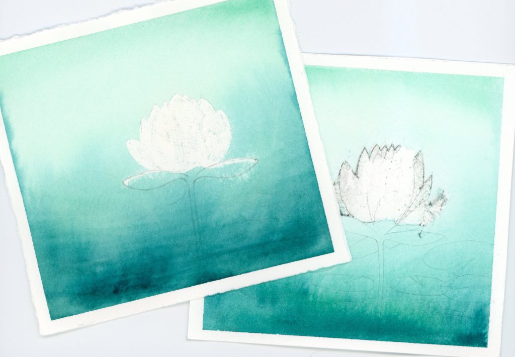
I should note as well that I’ve heard that Stonehenge Legion Cold Press paper, which I used for the first trial, has issues with masking fluid. I did use Arches Cold Press for the second one, which supposedly works better. I do think it worked better than Stonehenge when I’ve done this in the past. I believe the issue was the masking fluid I used.
I did improve a couple things in the new design, namely the luminosity of the blossom by limiting paint coverage, the addition of shadows for dimension, and toning down the lily pad color to blend better. I also added ripples in the water between the viewer and the blossom to add to the effect. I did originally have a clearer distinction between the part of the blossom that was above the water vs below (view above trials for clarity), but that got lost with additional layers of color. Maybe another version is in order. I’ll need to consider the aqua and green blending together, which I believe I can fix. Below is the comparison.
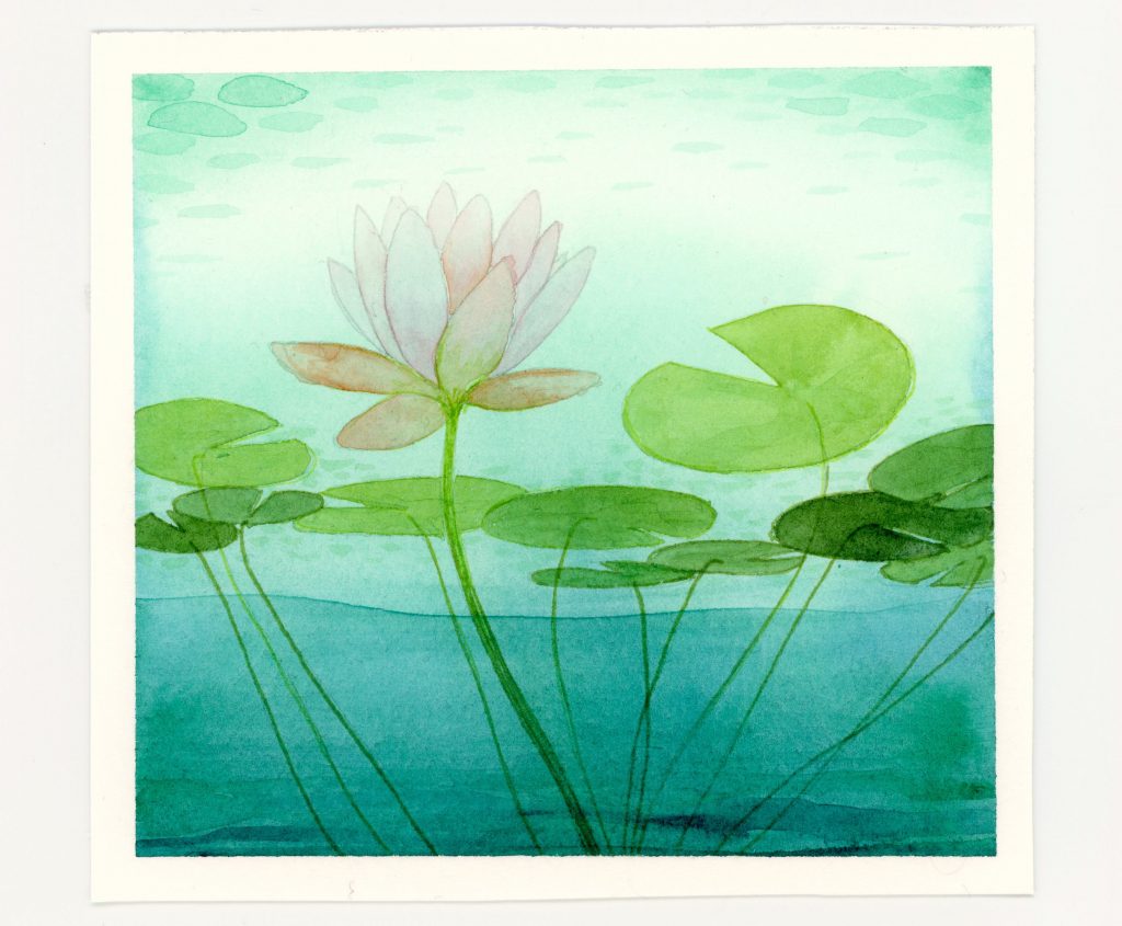
Original 
New Version

