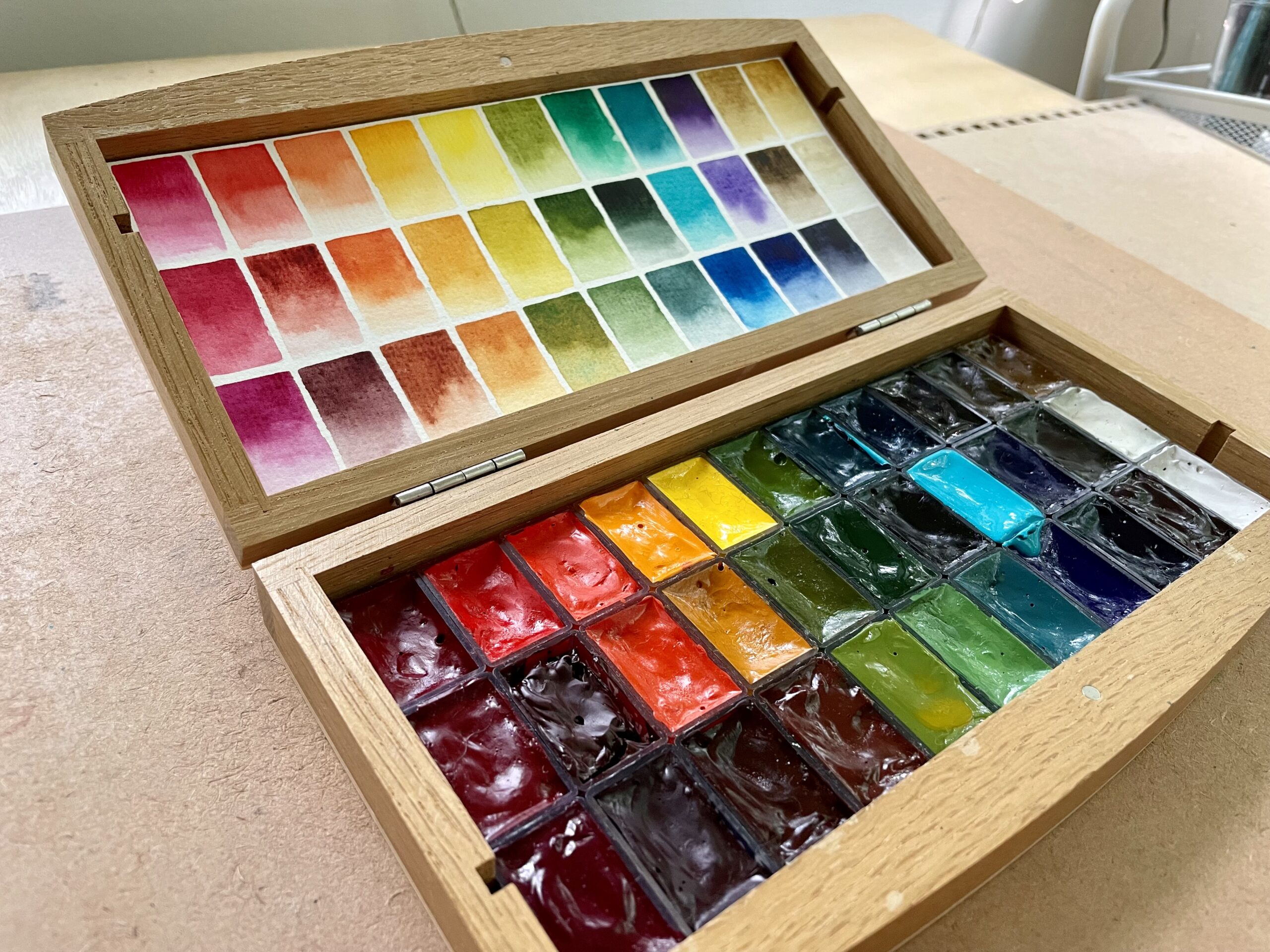
I assembled a palette with most of my Da Vinci and American Journey watercolor paints. Both are American brands and American Journey is an exclusive watercolor line of Cheap Joe’s. Both brands are very cost effective if you live in the United States (especially when purchasing the 37ml tubes) and the quality is very good. I will note one drawback up front. Some of the Da Vinci paints occasionally present a slight reflective sheen if the paint is laid down heavily. This does not happen very often and it hasn’t been a deterrent for me. I very much enjoy using the paints—they are highly pigmented, easy to activate and I have some particular favorites in the brand.
I’ve collected quite a few over the past few years and I wanted to try them together as a comparison to other brands. Most of these paints are from Da Vinci. The reason I’m combining the two brands in one palette is because I have heard that American Journey paints are processed by Da Vinci and I suspect there may be some crossover in formulas and quality. Also, combining the brands broadens the selection to include more of my favorite pigments and convenience mixes.
The palette I assembled is fairly well rounded. Maybe it’s a bit heavy on reds for my style of painting. I included a number convenience greens because I often do landscapes and enjoy having many at hand. We’ll see how this selection functions over time. All of the paints I included are highly lightfast—either very good or excellent. I have tested most of them for a period of 6 months with excellent results. All of them, including those I haven’t tested, include pigments known to be lightfast.
The chart below is my swatch sheet for the palette, including the front and the back sides.
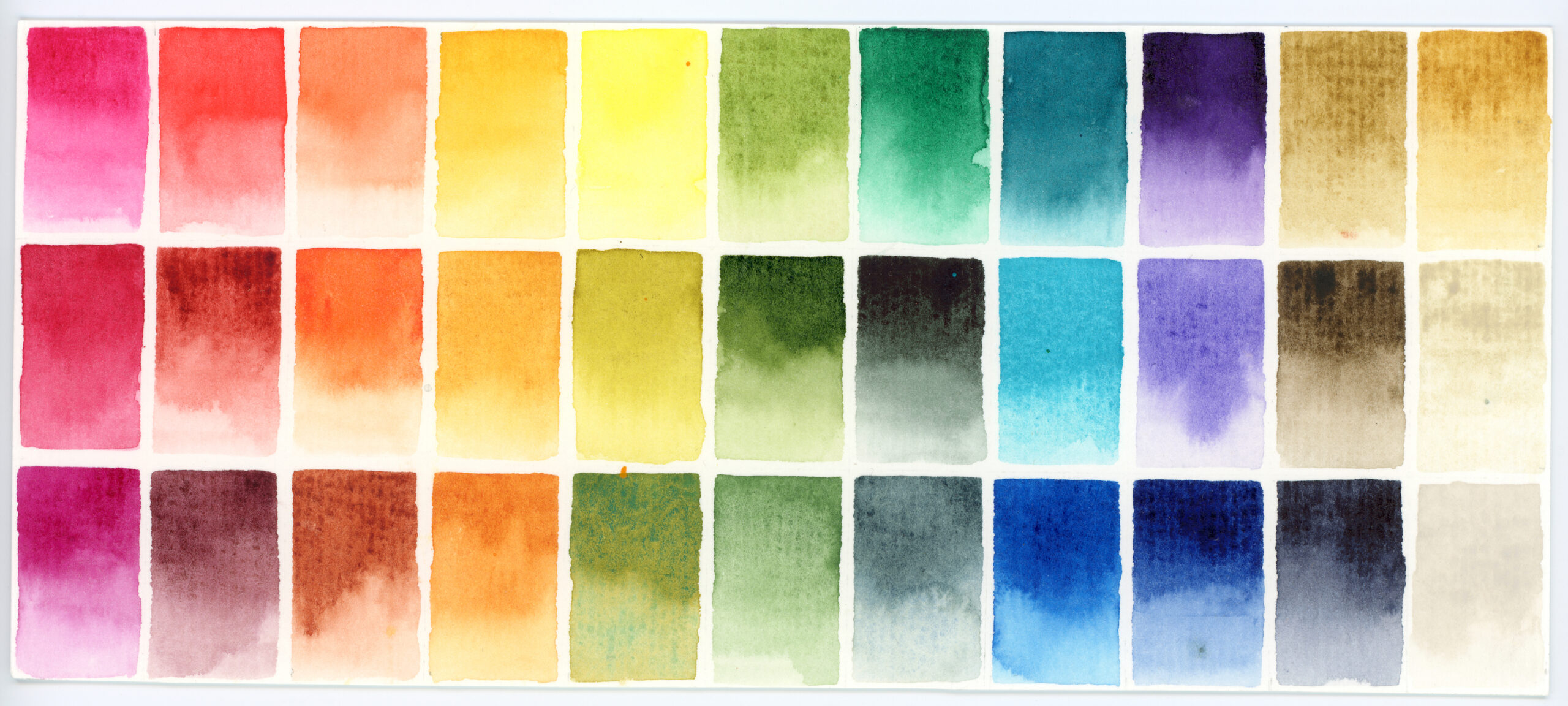
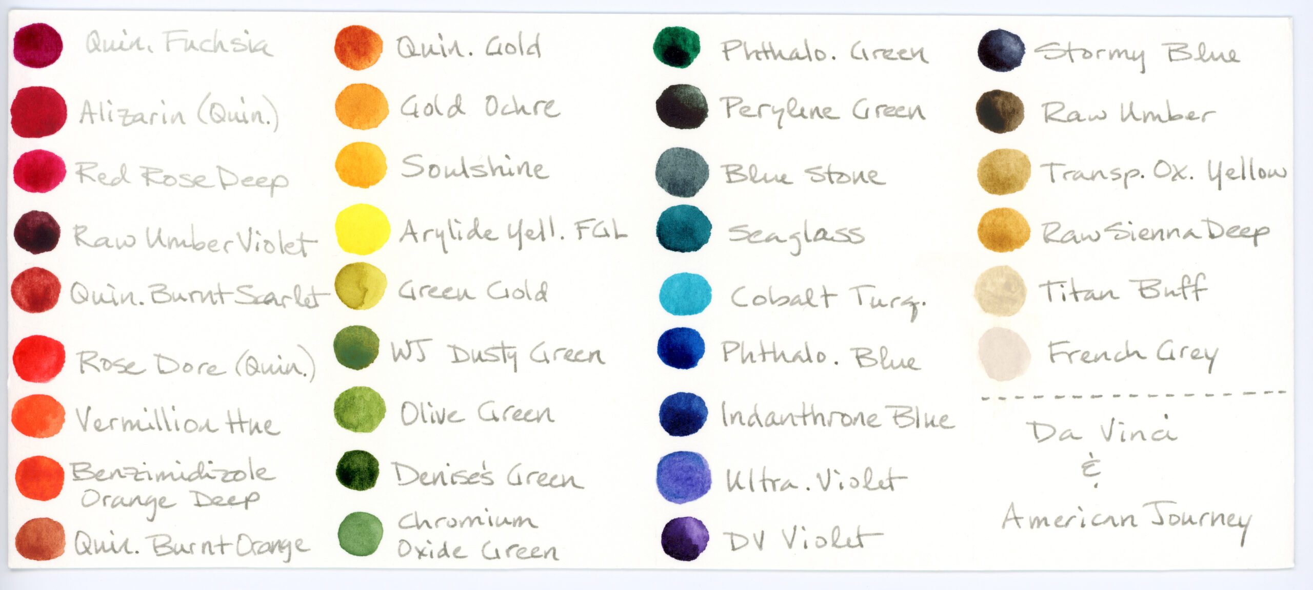
Paints Included
- Quinacridone Fuchsia (PR202), Da Vinci
- Red Rose Deep (PV19), Da Vinci
- Alizarin Crimson (Quinacridone, PV19), Da Vinci
- Raw Umber Violet (PBr7, PV19), American Journey
- Quinacridone Burnt Scarlet (PR206), American Journey
- Rose Dore (Quinacridone, PV19, PR188), Da Vinci
- Vermillion Hue (PR188, PO62), Da Vinci
- Benzamida Orange Deep (PO36), Da Vinci
- Quinacridone Burnt Orange (PR206, PR101), American Journey
- Quinacridone Gold Deep (PY150, PR206), American Journey
- Gold Ochre (PY42, PY83), Da Vinci
- Soulshine (PO62, PY97), Da Vinci
- Arylide Yellow (PY97), Da Vinci
- Green Gold (PY129), American Journey
- Ward Jene’s Dusty Green (PB36, PG7, PW6, PO62), American Journey
- Olive Green (PG7, PY42), Da Vinci
- Denise’s Green (PY129, PB60), Da Vinci
- Chromium Oxide Green (PG17), Da Vinci
- Phthalo. Green (PG7), Da Vinci
- Perylene Green (PBk31), Da Vinci
- Blue Stone (PB36, PY42), American Journey
- Seaglass (PB15:4, PG7), Da Vinci
- Cobalt Turquoise (PB36), Da Vinci
- Phthalo. Blue (PB15), Da Vinci
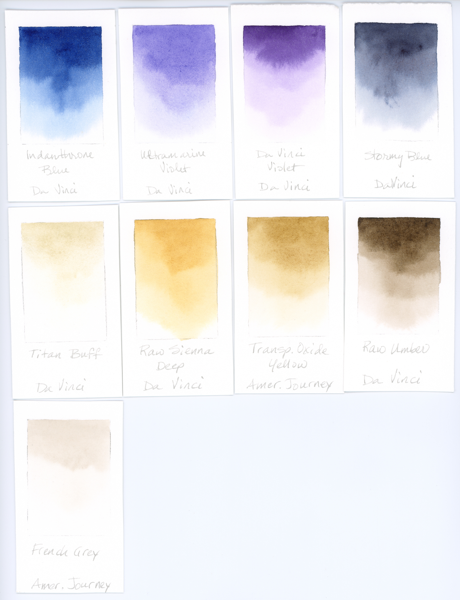
- Indanthrone Blue (PB60), Da Vinci
- Ultramarine Violet (PV15), Da Vinci
- Da Vinci Violet (PV23), Da Vinci
- Stormy Blue (PB60, PR101), Da Vinci
- Raw Umber (PBr7), Da Vinci
- Transparent Oxide Yellow (PY42), American Journey
- Raw Sienna Deep (PY42), Da Vinci
- Titan Buff (PW6), Da Vinci
- French Grey (PW6, PBr7), American Journey
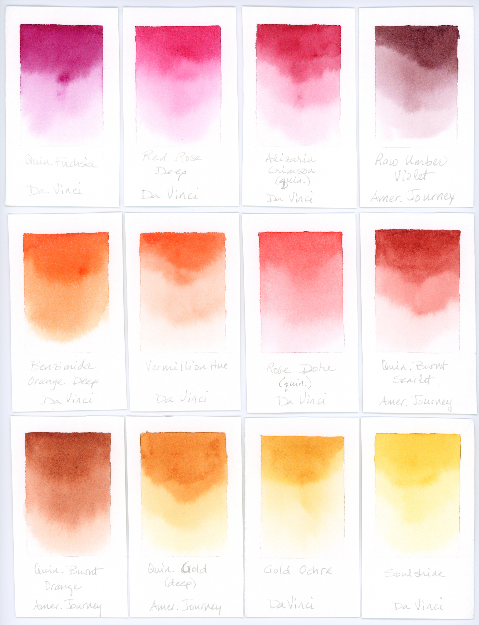
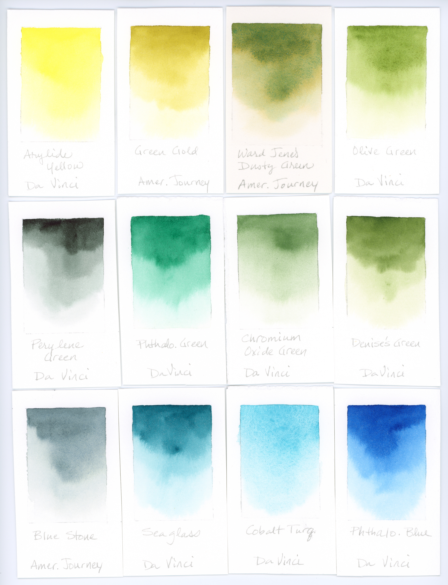
Here are swatches of each color (click to enlarge):
I also created a color mix chart focusing on greens—from teal to highly neutralized green-browns and a few grays.
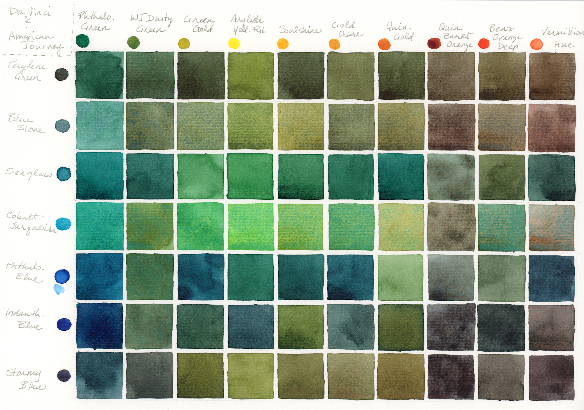
A few notes from creating the chart:
- Cobalt Turquoise, Blue Stone, WJ Dusty Green, and Stormy Blue displayed some interesting color separation in the mixes. I could have pushed this further with more water, especially with WJ Dusty Green and Stormy Blue.
- I particularly liked the muted aqua with the Blue Stone-Phthalo Green mix. I added just a touch of Phthalo Geen of course.
- Stormy Blue makes a lovely mossy green mixed with Green Gold or Arylide Yellow
- The red-orange mixes made some beautiful, velvety neutral browns and grays
- Indanthrone Blue and Quinacridone Burnt Orange created a perfect neutral gray-black
