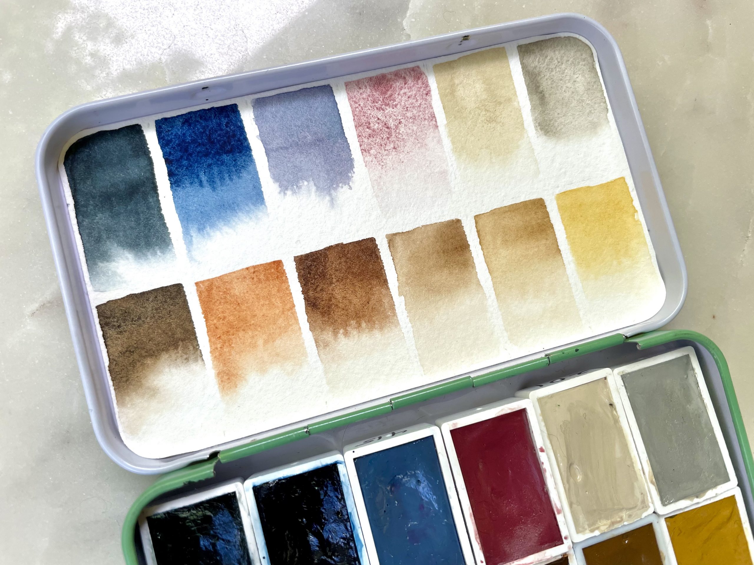
After creating my Autumn palette, I decided to swap out a few more colors in my Earth Tones palette. I have been wanting to experiment with creating natural textile textures in watercolor, such as the natural color variations and patterning in cotton or linen. This is not the only thing I intend for my Earth Tones palette, but it’s one on the list.
To this end, I removed the greens since I have them handy elsewhere, as well as Prussian Blue and swapped out a couple others for similar variations. I also added Potter’s Pink, which is a light pink with granulation. I’m hoping the light granulation might help me create light, natural earth tones with subtle color and texture variations I’m looking for. We’ll see!
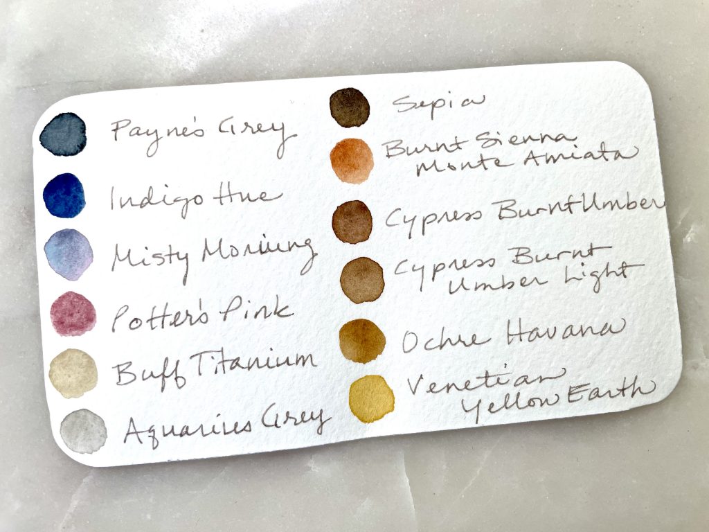
All of the following watercolors included are from the Roman Szmal Aquarius line:
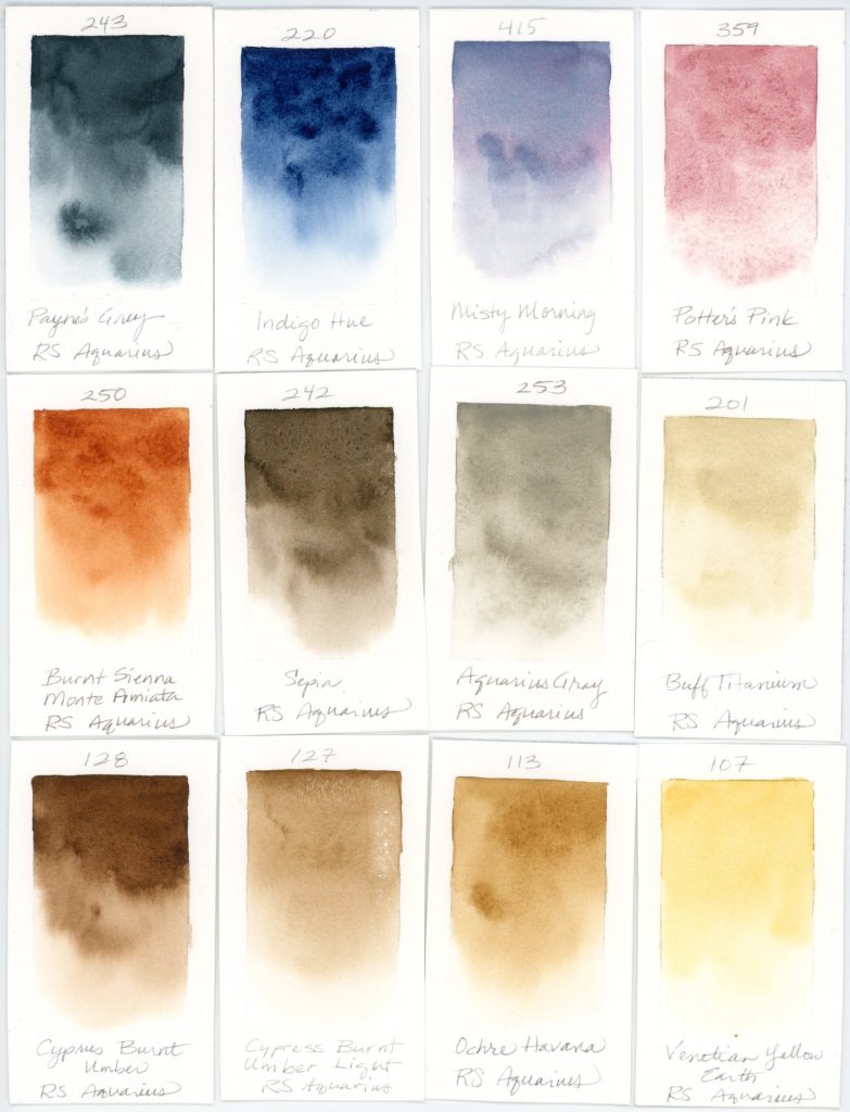
- Payne’s Grey–inky dark gray with a bluish undertone; great for dark clouds, deep shadows, or moody abstracts
- Indigo Hue–deep inky blue with lots of range
- Misty Morning–soft color-separating gray; lovely when diluted for subtle shadows and it adds character and depth with it’s characteristic color separation of blue and pink pigments–I used this for dragonfly wings and it added a wonderful ethereal effect
- Potter’s Pink–granulating soft, earthy pink; Roman Szmal’s version is particularly easy to reactivate and a beautiful color
- Burnt Sienna Monte Amiata–soft rusty orange
- Sepia–neutral-leaning brown with a dark mass tone, nice for tree trunks
- Aquarius Grey–a warm light gray with opacity; a new color for me, so we’ll see how I use it
- Buff Titanium–very light, warm neutral with some opacity; great for sandy beaches
- Cypress Burnt Umber–deep warm reddish brown
- Cypress Burnt Umber Light–lighter version of the above with a little less red
- Ochre Havana–warm, caramel brown, makes a wonderful cream color when well diluted
- Venetian Yellow–nice soft, golden earthy yellow, very transparent too
