For comparison, my primary palette has more bright, saturated colors. I recently slimmed down my primary palette to fit into another bamboo palette box. I haven’t done a post on the change since it’s not significantly different, but if you’d like more information on the colors, you can view my last primary palette post.
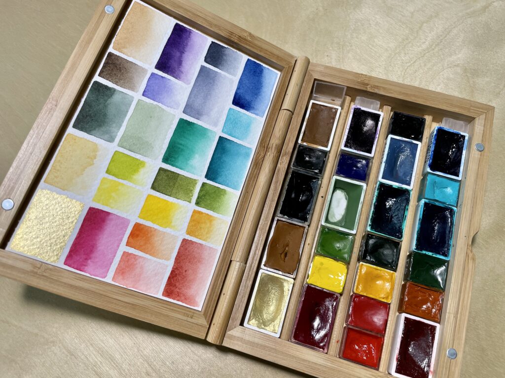
There are a handful of colors in both the muted palette and my primary palette, namely Quinacridone Maroon, Perylene Green, Earth Green, and Indanthrone Blue. I will likely be using one palette or the other, so I don’t mind the repeats, and they are some of my favorite muted colors.
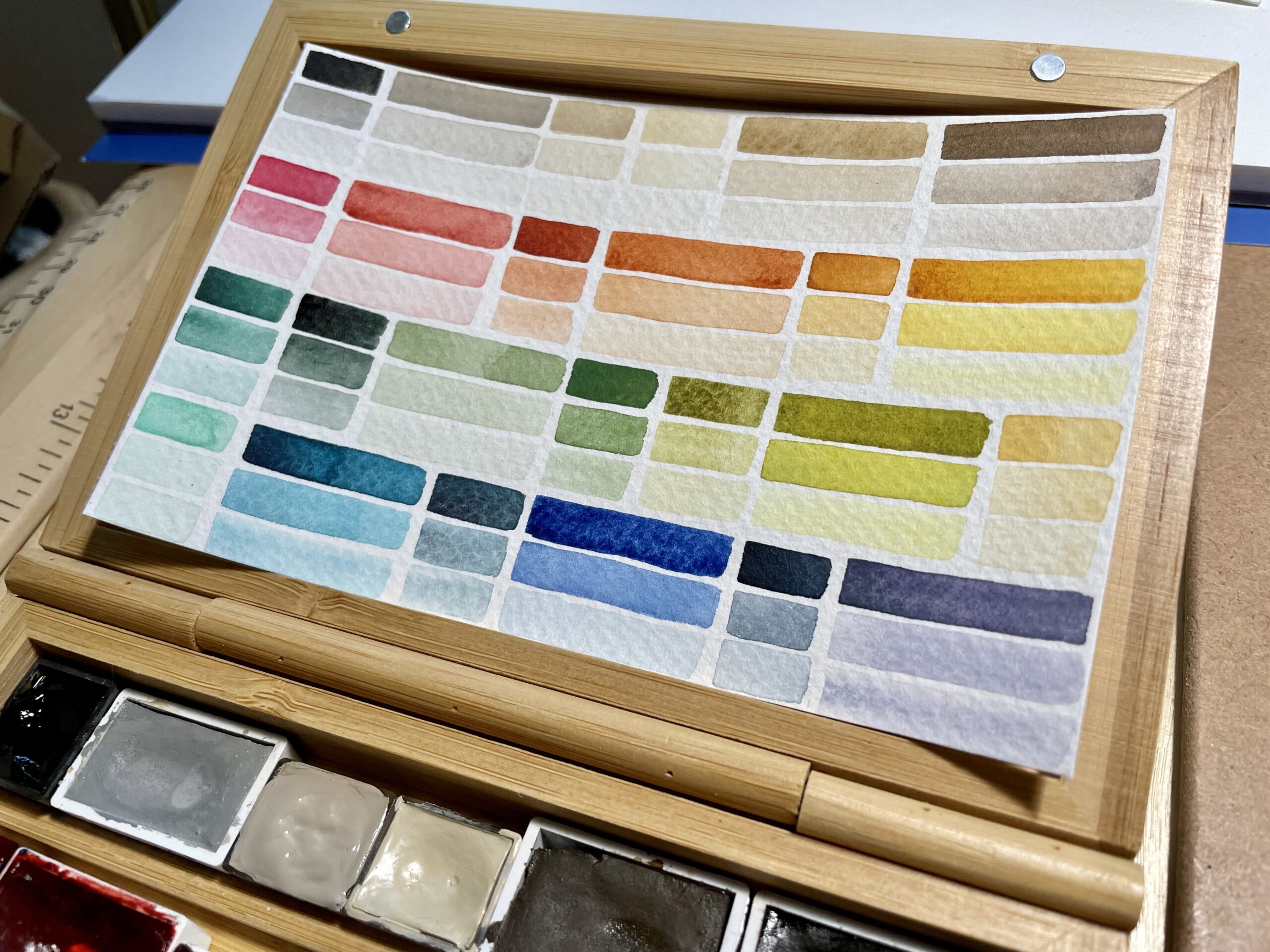
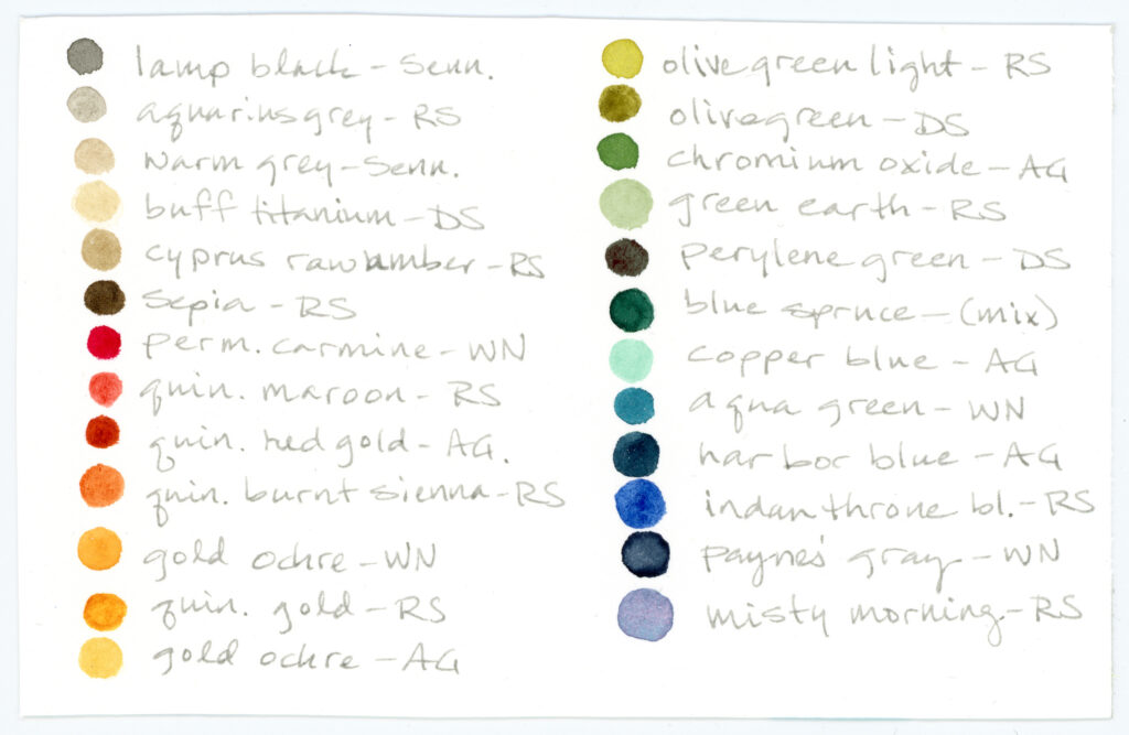
Colors included (plus notes):
- Lamp Black, Sennelier–lovely warm black
- Aquarius Grey, Roman Szmal–semi-opaque, warm gray, surprisingly nice for muting colors
- Warm Grey, Sennelier–lovely soft, warm color for a semi-opaque wash
- Buff Titanium, Daniel Smith–also a lovely soft semi-opaque color, warmer than Warm Grey, and makes surprisingly nice mixes
- Cyprus Raw Umber, Roman Szmal–I use this for a nice off-white transparent wash
- Sepia, Roman Szmal
- Permanent Carmine, Winsor & Newton–I’m not sure how much I’ll use this, maybe just a touch here and there. I may swap this out for Rosa Pietra from A. Gallo, a softer color, if I get a hold of it
- Quinacridone Maroon, Roman Szmal–a favorite, makes nice soft peachy tones when diluted
- Quinacridone Red Gold, A. Gallo–a beautiful, rich, rust color
- Quinacridone Burnt Sienna, Roman Szmal
- Gold Ochre, Winsor & Newton–opaque deep golden earthy yellow
- Quinacridone Gold, Roman Szmal–a pungent earthy yellow that dilutes to a lovely pale yellow
- Gold Ochre, A. Gallo–transparent, soft earthy yellow with low tinting strength
- Olive Green Light, Roman Szmal–a pungent earthy green that dilutes down to a very cool yellow
- Olive Green, Daniel Smith–more muted and earthy than Olive Green Light and easier to use in larger areas without overpowering
- Chromium Oxide, A. Gallo–a lovely semi-opaque, muted green
- Green Earth, Roman Szmal–soft pale muted green, and an all-time favorite (I highly recommend using the Roman Szmal brand for this color as other brands can be streaky, too pale, or hard to re-wet)
- Perylene Green, Daniel Smith–a dark moody green and another all-time favorite
- Blue Spruce (custom mix)–I had made this a while ago as a lightfast deep evergreen and decided it might fit here
- Copper Blue, A. Gallo–opaque aqua color I haven’t really used before
- Aqua Green, Winsor & Newton–slightly muted, yet rich, teal color
- Harbor blue, A. Gallo–moody, granulating blue, leaning toward green
- Indanthrone Blue, Roman Szmal–favorite rich dark blue that dilutes to a beautiful pale blue
- Payne’s Gray, Winsor & Newton
- Shadow Violet, Roman Szmal–trying to decide between Shadow Violet and Misty Morning for a pink-blue separating gray (the swatch is Shadow Violet and the reference is Misty Morning). One is darker and both are lightfast (as opposed to similar colors across brands)
For the swatch card, I decided on swatches with three dilutions, which is a more ‘graphic’ way of looking at the colors as opposed to gradients. This is because I intend to do mixed media and I have a more graphic style in mind. We’ll see if that’s what I do ;-)
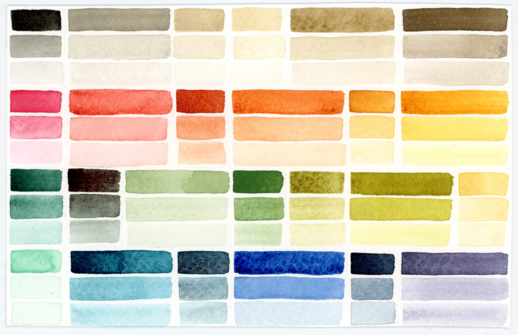
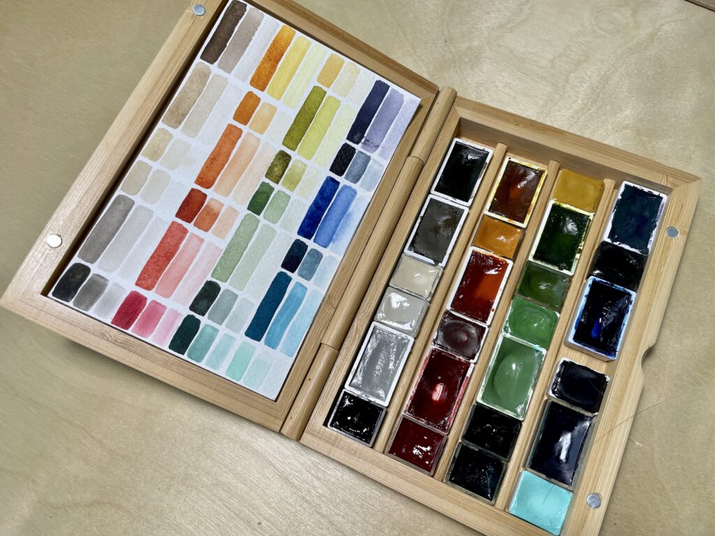
The back of the card has a color reference.
This will be an interesting experiment. One, because there are many opaque or semi-opaque colors in this palette. Two, because I am experimenting more with multimedia and I’m excited to see what happens with that direction. I’ve been using custom-mixed pigmented inks with my watercolor for awhile and just started adding a bit of acrylic ink into the mix. I plan on expanding that practice with colored pencils as well. More on that to come!