Here is my current logo for comparison, which works well, even at small sizes because of its simplicity and crisp edges.

As an example, at a smaller scale you can start to see the complexity working against the watercolor design when it comes to comprehending at a glance.
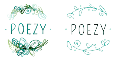
At an even smaller scale it looks a bit incomprehensible. If you saw this for the first time, You’d have a hard time figuring out the concept, making it difficult to remember.

The seashell design is definitely not as clear, but I might try again with a simpler design since I do like the added character and direct relationship to my artwork.