I’ve been collecting random watercolors from the Sennelier brand for a while and because I’m adding a few new ones, I decided to pull them together and make a palette. It will be useful for me to get a feel for how Sennelier paints behave compared to other brands. They are known for glazing well and I’ve heard a few people say they are ‘more luminous’ or have a quality that is difficult to explain, so it will be interesting to compare with other brands I use regularly (Daniel Smith, Winsor & Newton, Roman Szmal Aquarius, etc.).
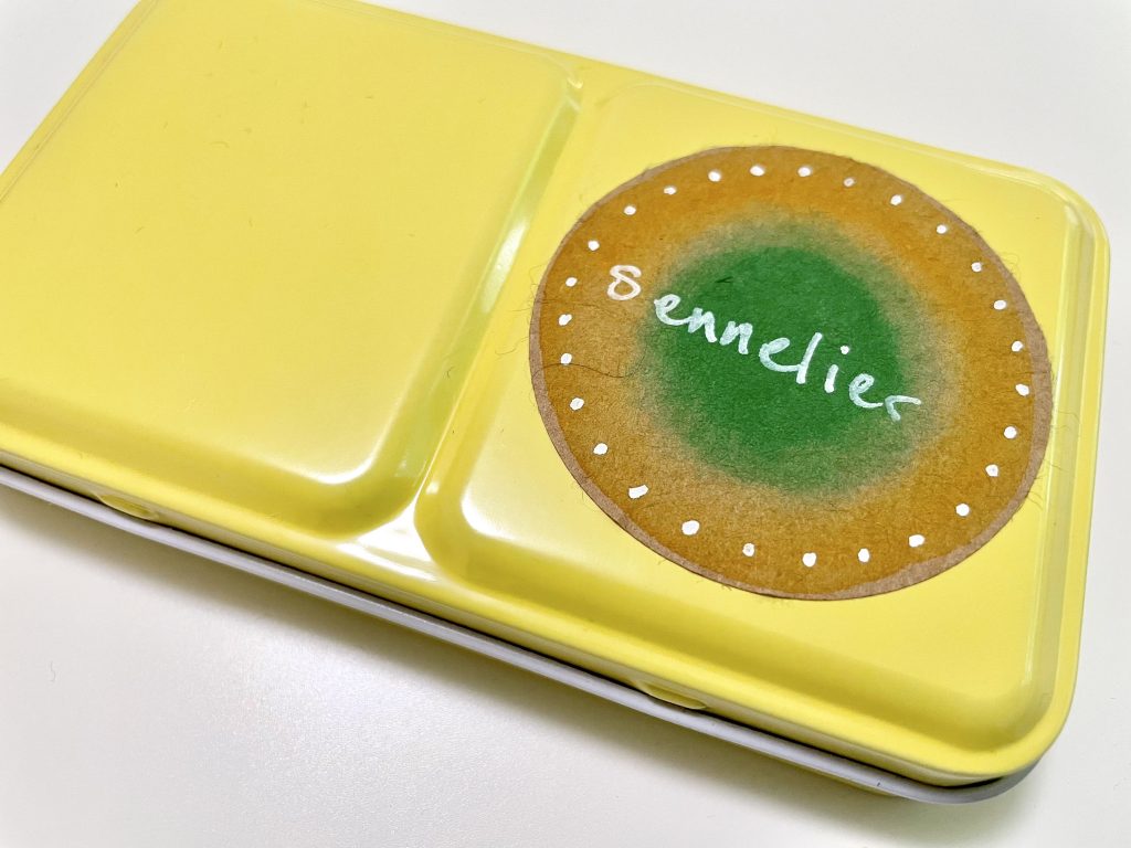
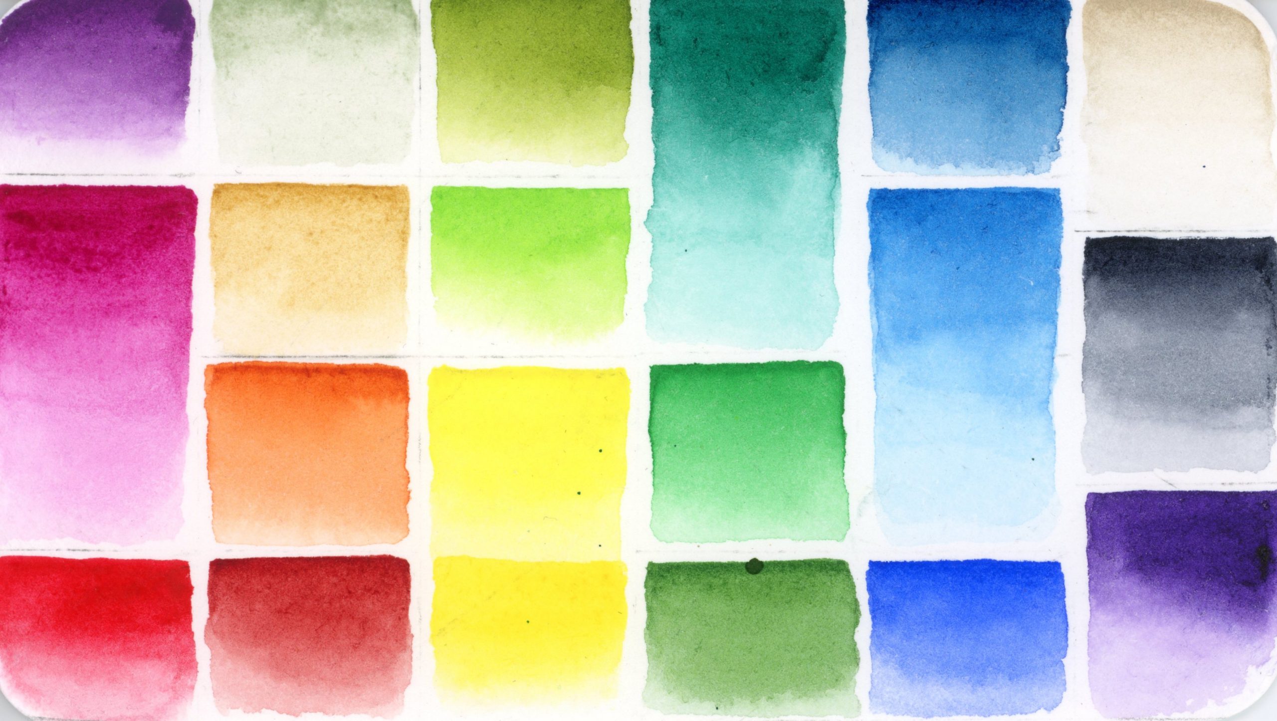
I decided to assemble the colors in a small metal palette without the insert, so I used magnets to affix them and added as many as I could fit. I did decide to have full pans for some of the main colors I would use and half pans for the rest and ended up with 20 colors. In the end, I left a handful out and included a couple custom mixes out of colors I thought I might not use.
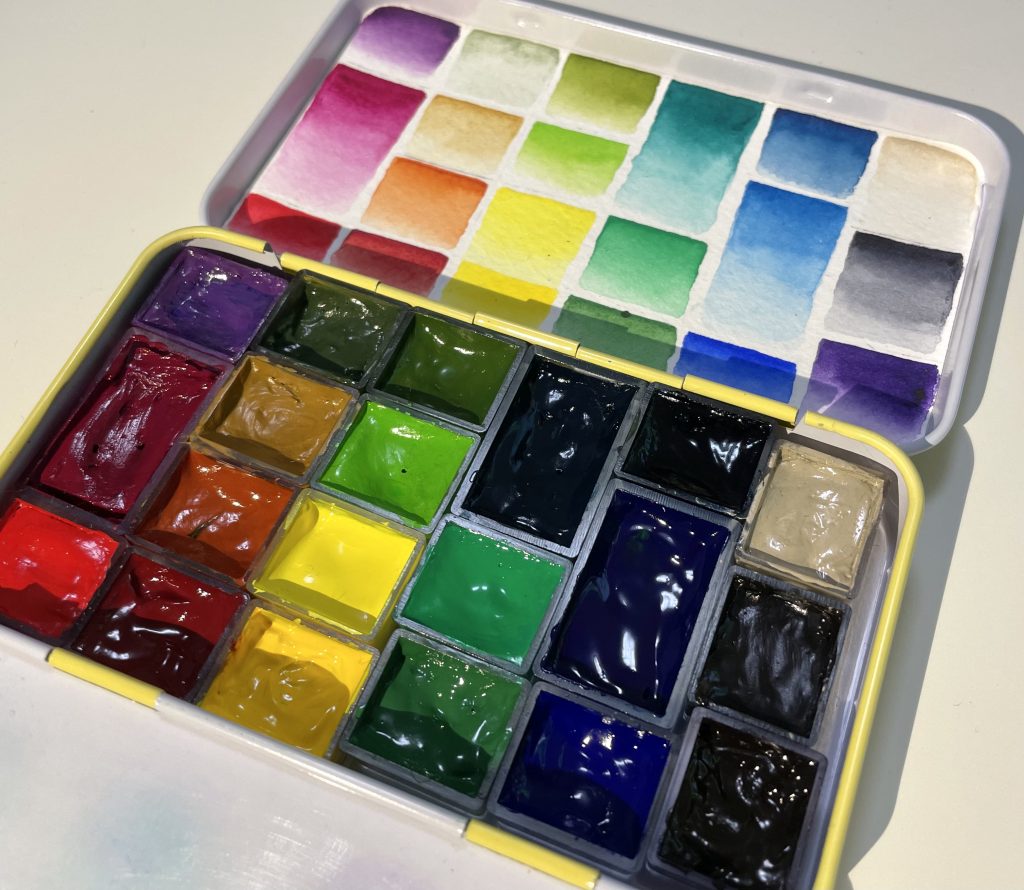
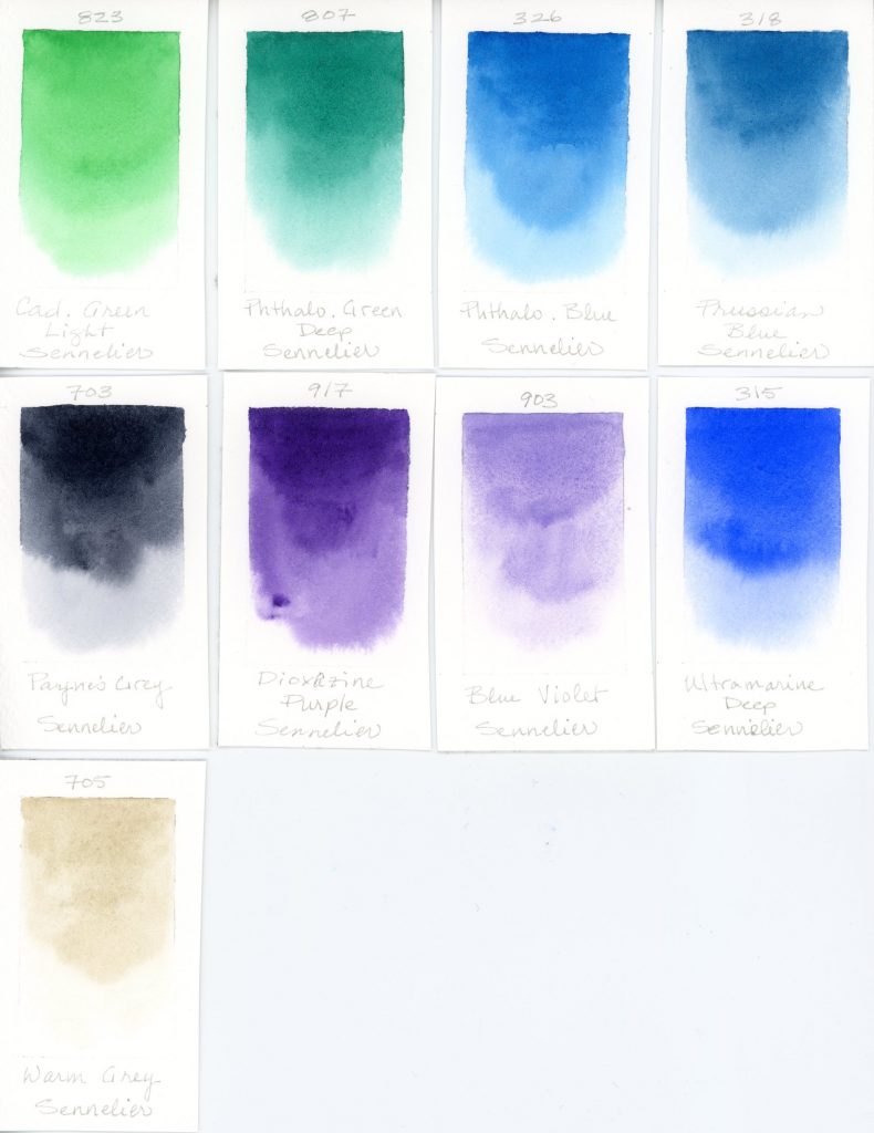
Here are the colors I included in the palette, including the custom mixes I created:
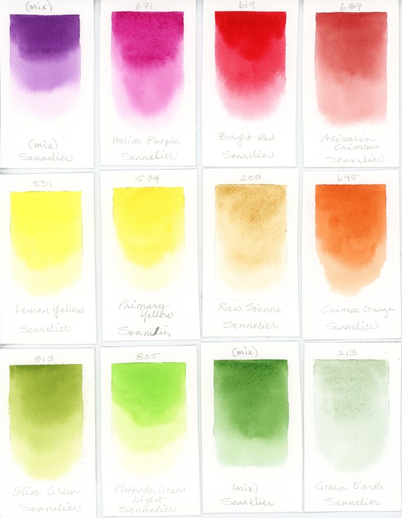
- Purple Mix–Cobalt Violet Light Hue and Dioxazine Purple
- Helios Purple (full pan)
- Bright Red
- Alizarin Crimson
- Chinese Orange
- Raw Sienna
- Primary Yellow
- Lemon Yellow
- Olive Green
- Phthalo. Green Light
- Green Mix–Bright Yellow Green, Prussian Blue, and Raw Sienna
- Green Earth
- Cadmium Green Light
- Phthalo. Green Deep (full pan)
- Phthalo. Blue (full pan)
- Prussian Blue
- Ultramarine Deep
- Blue Violet
- Dioxazine Purple
- Payne’s Grey
- Warm Grey
These are the colors I left out–mainly fugitive and redundant colors.
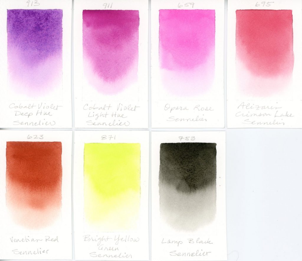
- Cobalt Violet Deep Hue
- Cobalt Violet Light Hue
- Opera Rose
- Alizarin Crimson Lake
- Venetian Red
- Bright Yellow Green
- Lamp black
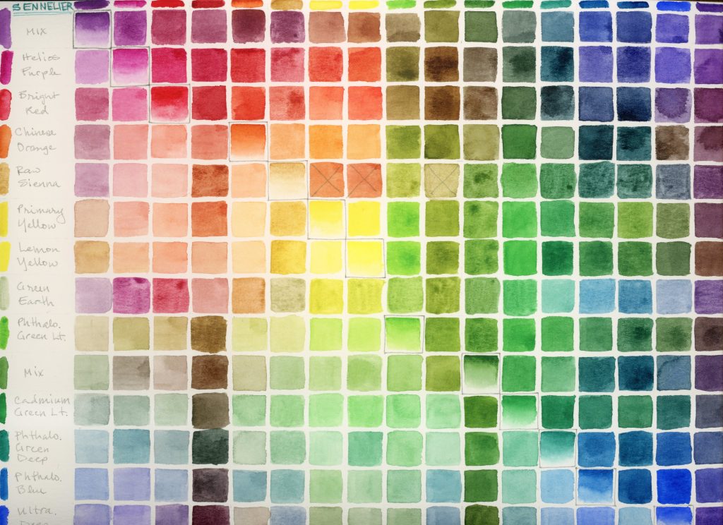
I also made a color mix chart (the X indicates a mistake). I am particularly drawn to the rich mossy greens and Sennelier’s Olive Green is becoming one of my favorite watercolor paints. I also really like the vibrant Helios Purple and I’ve heard it is lightfast (being a PR122, Quinacridone Magenta), though it’s labeled as only ‘Fair’.
