As I was refreshing my primary watercolor palette and creating a travel palette, I decided to create a 3-color mini palette to play with. I’ve been improving my ability to mix colors and thought it would be a good exercise to see what I could do with just 3 watercolors.
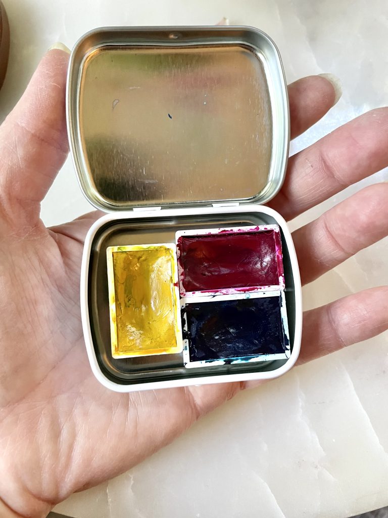
I assembled 3 primary colors following the CMY system of Cyan, Magenta and Yellow. All of the paints are from the Roman Szmal Aquarius line.
- C—Phthalo. Blue (red shade)—I knew I wanted to have a more cyan or turquoise blue, but tried the red shade first because it was at hand
- M—Magenta
- Y—Indian Yellow Hue
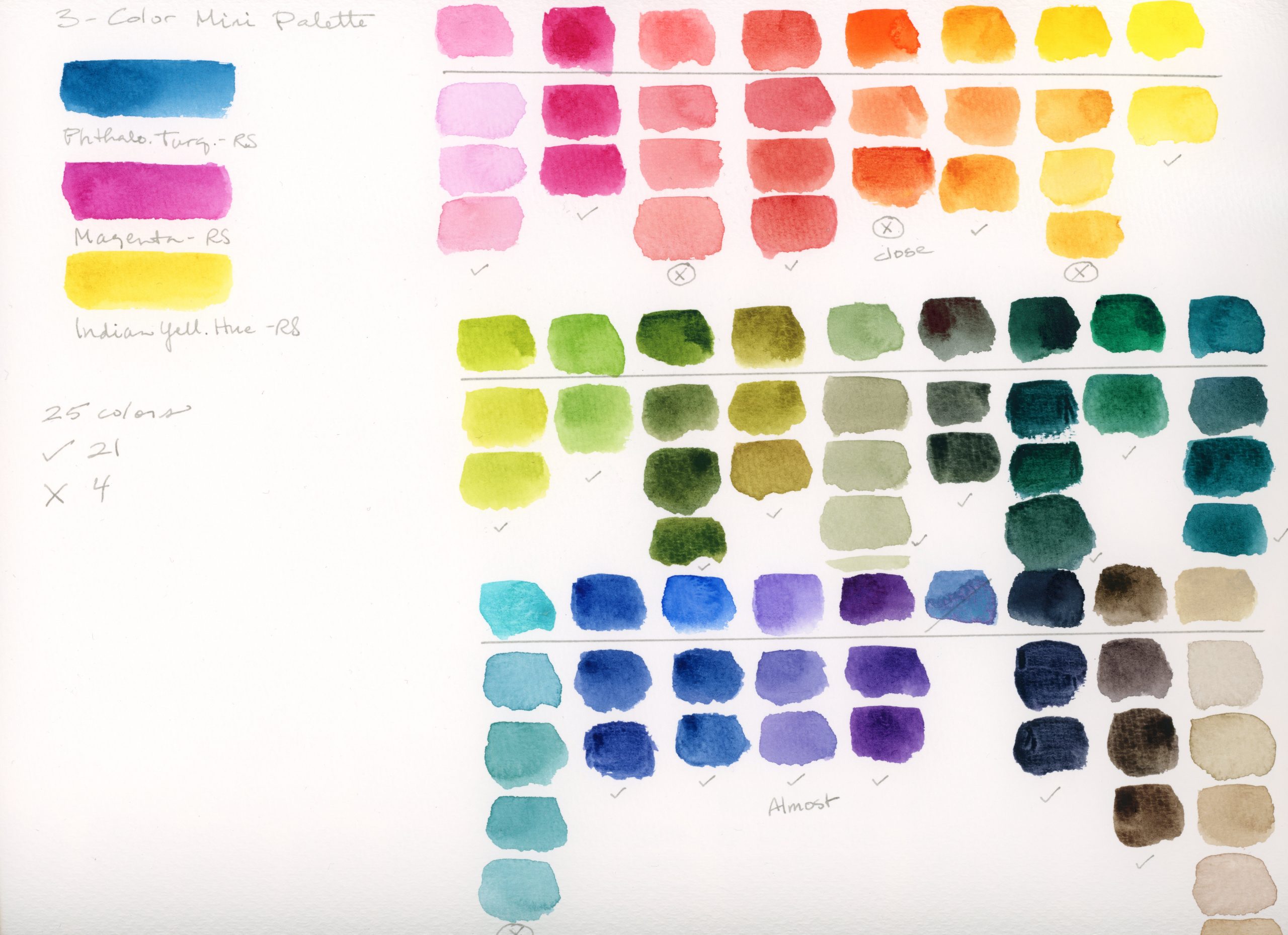
I have 24 colors in my primary palette, so I swatched all of them and attempted to reproduce all the colors with the 3-color palette.
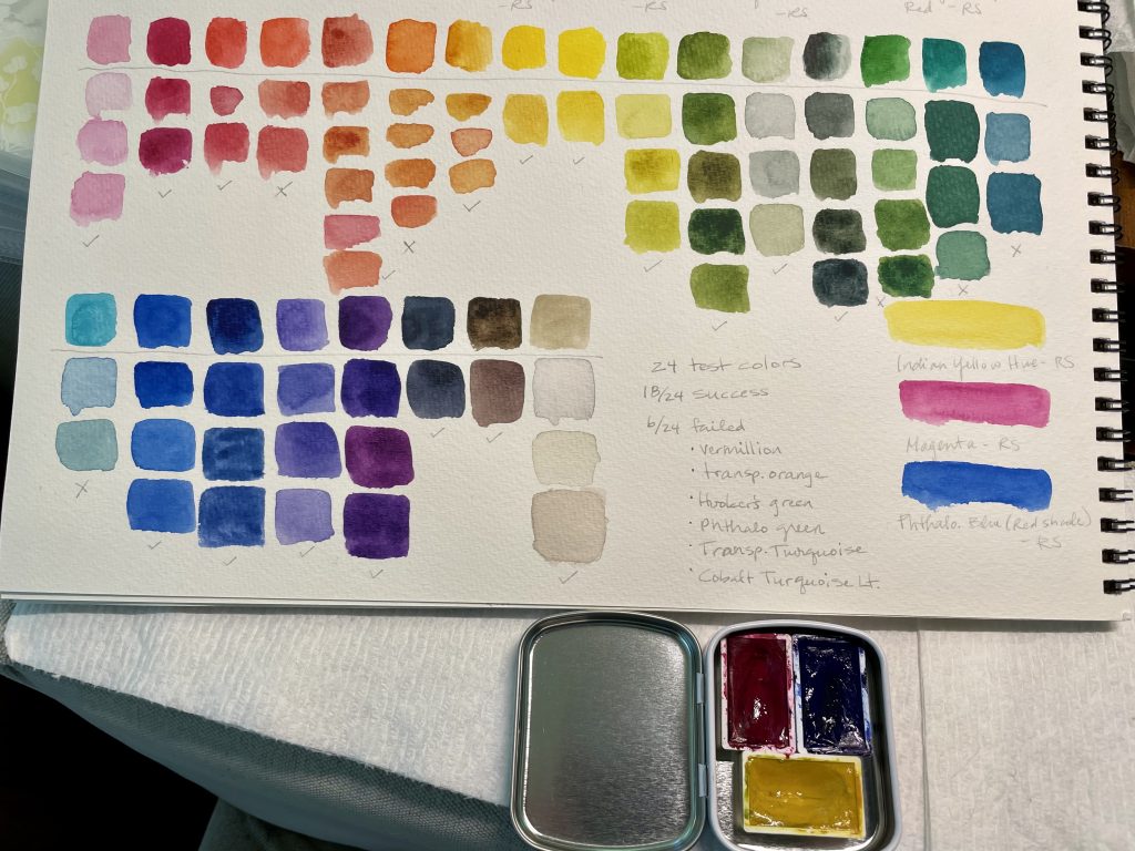
I knew this palette would be versatile, but I was surprised at just how close I got to matching all of the colors. The Phthalo. Blue (red shade) did great matching the purples, warm blues and most greens, but the cool blues weren’t as vibrant. The Magenta did great with pinks and purples, but didn’t quite get the vibrancy of the oranges. This is generally ok for me since I don’t use very bright oranges. I do use a lot of teal and turquoise colors, so I did want to improve that.
Next, I swapped out the Phthalo. Blue (red shade) for Phthalo. Turquoise (also by Roman Szmal). Any Phthalo. Blue (green shade) would work well here.
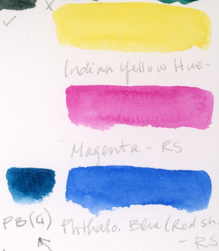
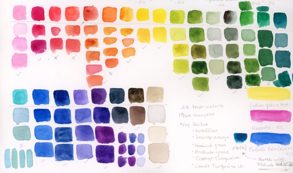
With the Phthalo. Turquoise, I tried matching the blues, green and purples that failed before. I was able to match the cool blues with this modification, specifically the Phthalo. Green (blue shade) and Transparent Turquoise as well as the bright green. I was not able to match the Cobalt Turquoise Light (by Winsor and Newton) shown at the bottom left of the swatches. The purples weren’t quite as bright, but still looked good. The rest was the same.
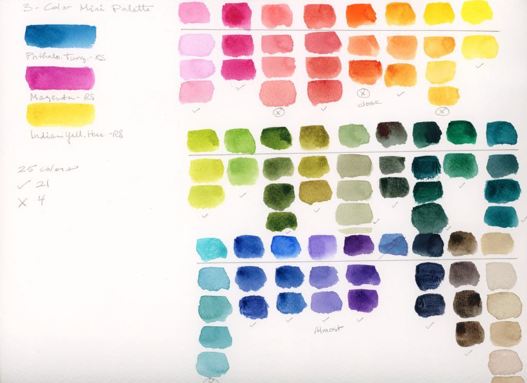
After updating my primary palette with a few color changes, I decided to try color matching all of the colors with the modified 3-color palette and got similar results. I couldn’t quite match the vibrancy on the peachy color (Rose Dore by Winsor and Newton), the orange (Transparent Orange by Winsor and Newton), and the warm yellow (Indian Yellow Hue by Jackson’s). I might get better results with a brighter yellow than Indian Yellow Hue by Roman Szmal. I could almost reach the vibrancy of the violet (Cobalt Blue Violet by Daniel Smith), but not quite. The one that was the furthest off was the Cobalt Turquoise Light (by Winsor and Newton).
All in all, this was a fun experiment and I’m very pleased with how well the little palette did.
