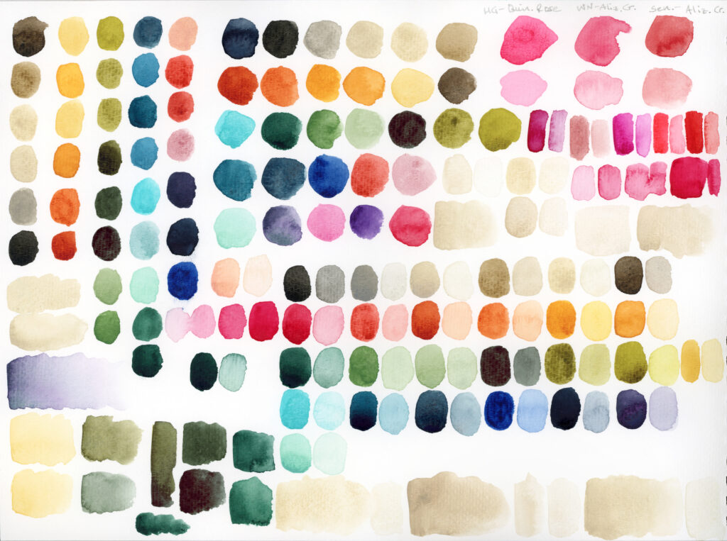
First, I assembled and swatched out the colors I was considering and did some comparisons. I’m leaning heavily on light earthy tones, muted greens and blues, ochres and siennas, and a few moody darks. The pink is there as a highlight, but makes the swatches look much brighter than the palette will actually be. I may swap out the Alizarin hue with a soft muted pink from A Gallo (Rosa Pietra) when I can get my hands on it. I was going to use Potter’s Pink, but I think a warmer hue would suit this palette better.
Then I tried out some color mixes with a few semi-opaque neutrals to learn how they mix and gauge suitability.
- Row 1: Warm Grey, Sennelier
- Row 2: Cyprus Raw Umber, Roman Szmal
- Row 3: Buff Titanium, Daniel Smith
- Row 4: Aquarius Grey, Roman Szmal
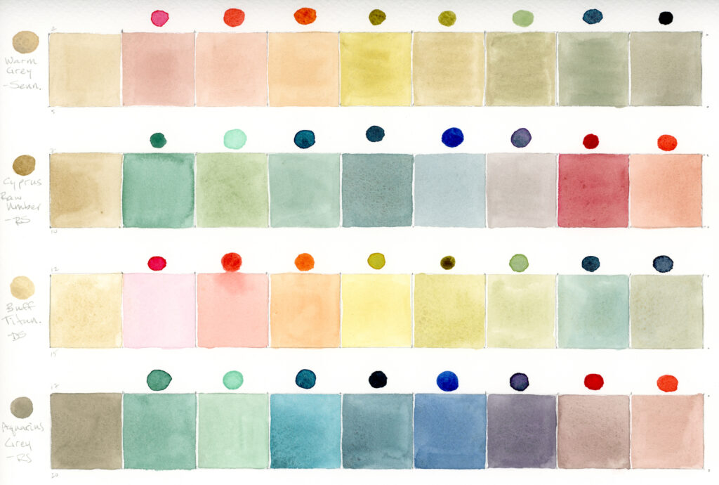
The Warm Grey mixes (first row) are ok, but I prefer to use this color as is instead of mixing with it—the mixes are a tad dull. The Cyprus Raw Umber (second row), a color I use for a pale off-white wash, is a good low tinting strength, transparent color for subtly muting colors. I was surprised at how vibrant the buff titanium mixes were (third row) and really like how the Aquarius Grey softened colors (fourth row).
Next step, narrow down what will fit in my little bamboo palette—stay tuned!
