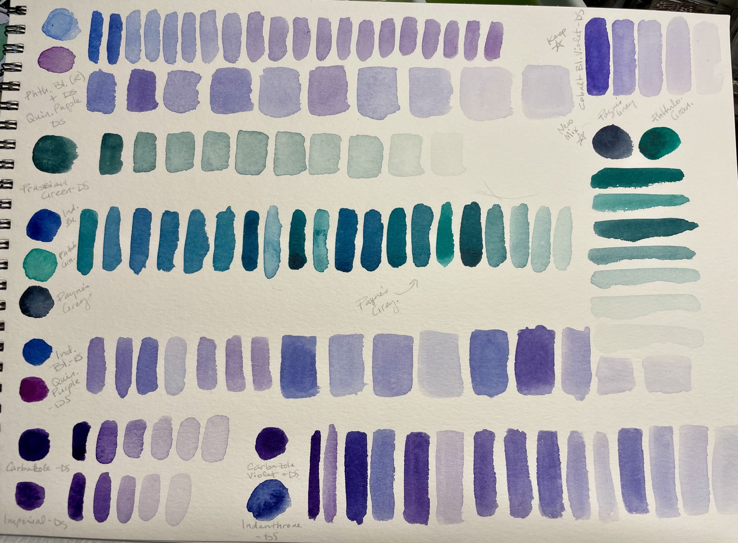
I decided to review my primary watercolor palette and swap out a few colors. I wanted to add a couple new colors so I reviewed the whole thing and did a series of comparisons. Here are a couple pages showing the original layout, a potential new layout, some mixes, etc. I’ve been searching for a non-granulating violet-blue. You can see my newest comparisons and mixes on the second sheet below. Because most warm blue watercolor paints are granulating, it’s difficult to get the vibrancy of Cobalt Blue Violet, the closest match to what I want. I ended up leaving that in the palette and fortunately it’s granulation is minimal. I compared Buff Titanium to Warm Grey by Sennelier and chose to go with Buff Titanium because it’s a single pigment paint. Another paint I wanted to add was Prussian Green, but it has issues with lightfastness. Apparently it fades in light and then will return to normal if removed from the light. I’m not sure how bright a room has to be for this effect to occur, but I thought I’d mix my own with lightfast paints. You can see some of the mixes on the second sheet below.
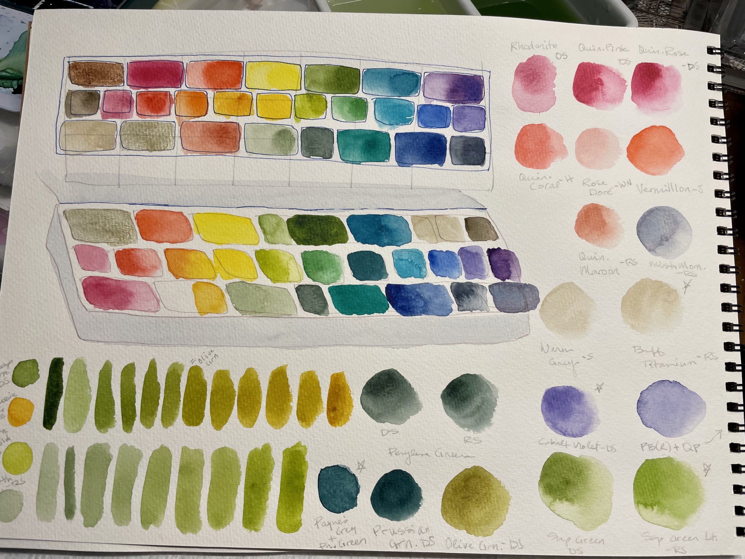
I made small swatches the size of the pans to play with layouts. This is something I put a lot of time into to make sure it works for me. I like to group colors by hue and I consider what color I might choose between or mix while painting. To help with this, I make swatches the size of the pans I want to use, sometimes making multiple sizes of the same color so I have options when fitting them in. This is a bit tedious, but I enjoy it. Below is an example of a layout for my primary palette and two travel palettes I worked on at the same time.
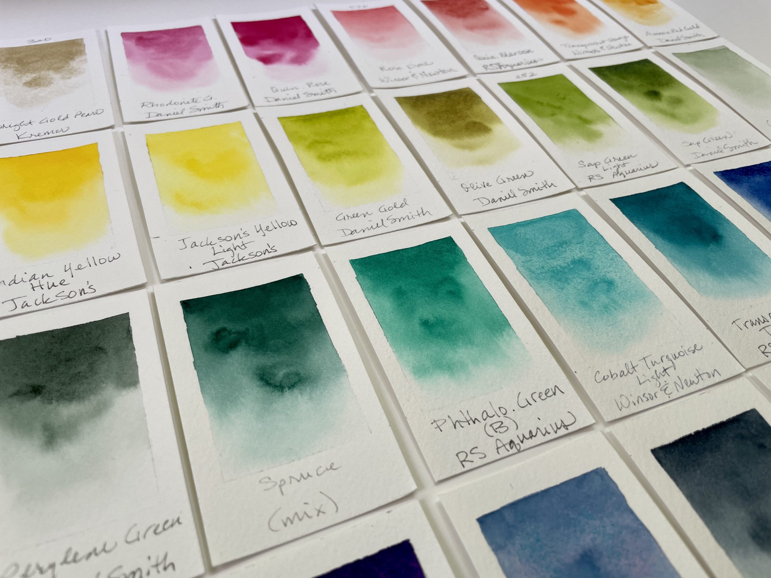
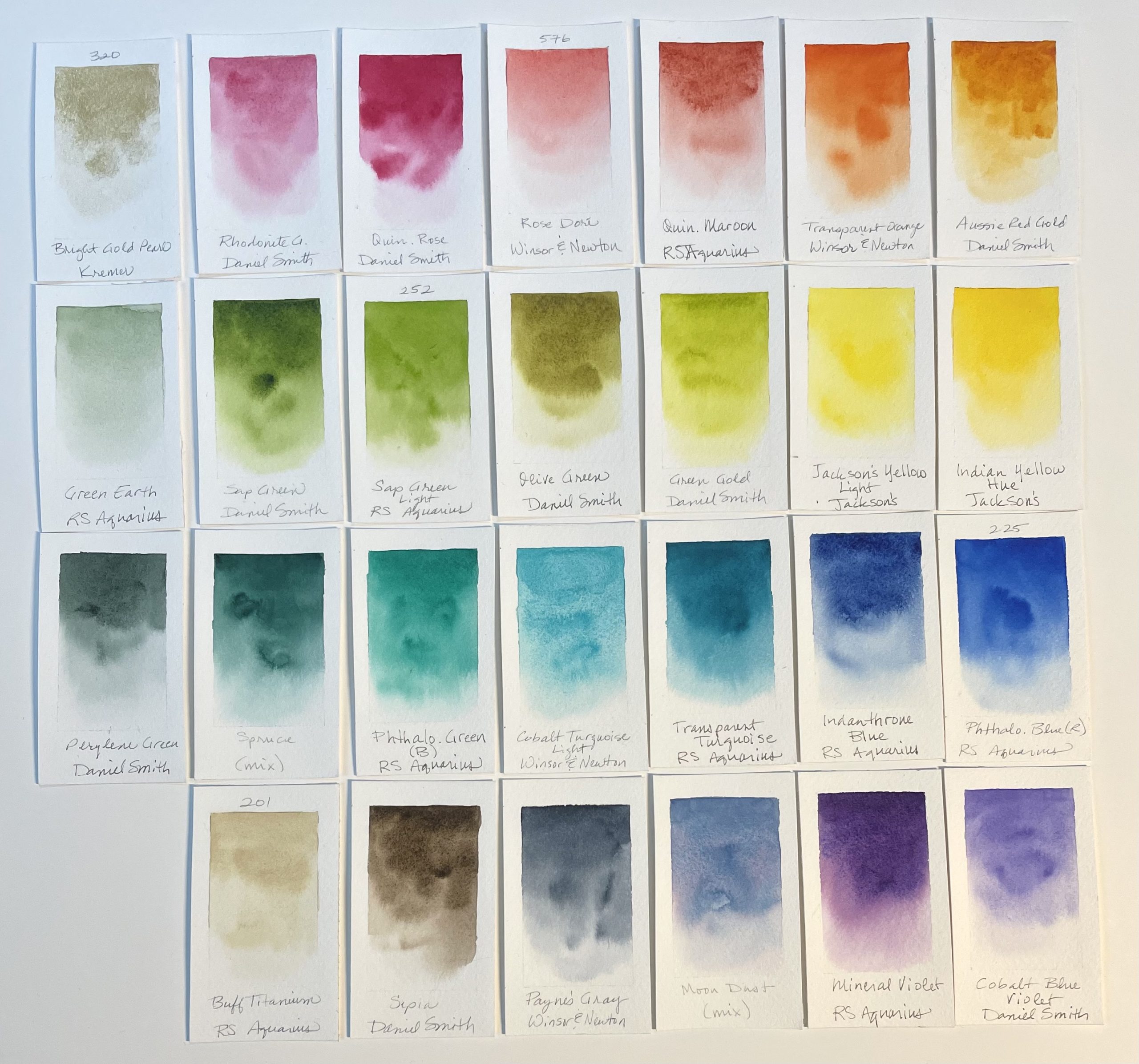
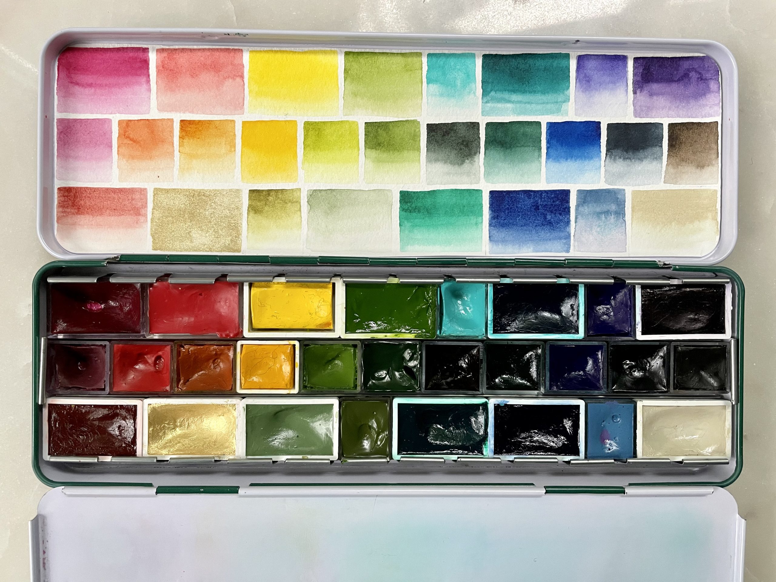
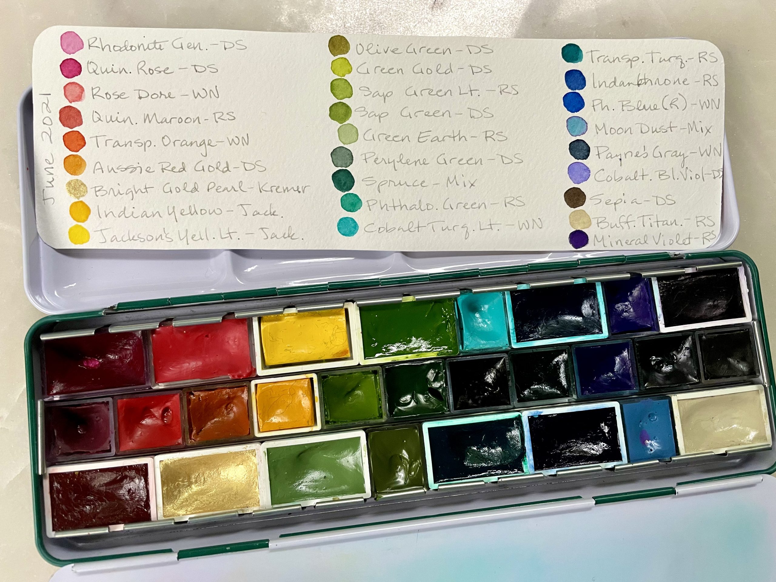
Here is the full selection of 27 paints for the new layout:
- Bright Gold Pearl—Kremer
- Rhodonite Genuine—Daniel Smith
- Quinacridone Rose—Daniel Smith
- Rose Dore—Winsor and Newton *New
- Quinacridone Maroon—Roman Szmal Aquarius
- Transparent Orange—Winsor and Newton
- Aussie Red Gold—Daniel Smith
- Indian Yellow Hue—Jackson’s
- Jackson’s Yellow Light—Jackson’s
- Green Gold—Daniel Smith
- Olive Green—Daniel Smith *New
- Sap Green Light—Roman Szmal Aquarius *New
- Sap Green—Daniel Smith
- Green Earth—Roman Szmal Aquarius
- Perylene Green—Daniel Smith
- Spruce—custom mix *New
- Phthalocyanine Green (blue shade)—Roman Szmal Aquarius
- Cobalt Turquoise Light—Winsor and Newton
- Transparent Turquoise—Roman Szmal Aquarius
- Indanthrone Blue—Roman Szmal Aquarius
- Phthalocyanine Blue (red shade)—Roman Szmal Aquarius
- Cobalt Blue Violet—Daniel Smith
- Mineral Violet—Roman Szmal Aquarius
- Moon Dust—custom mix *New
- Payne’s Gray—Winsor and Newton
- Sepia—Daniel Smith
- Buff Titanium—Roman Szmal Aquarius *replaced Warm Grey by Sennelier
I added 6 new colors:
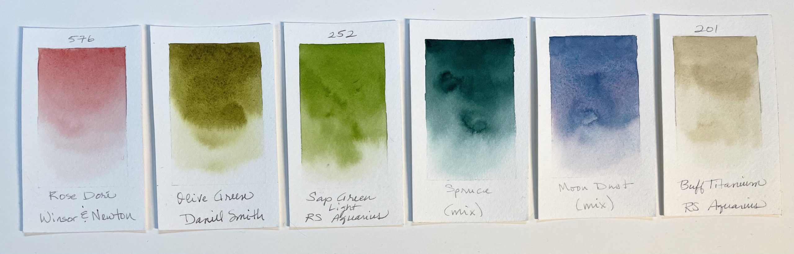
- Rose Dore, Winsor and Newton—a beautiful, soft peachy color. I’m a bit obsessed with peach tones and have tried a few other paints that are often too saturated or pungent for my uses, so I’m hoping this soft tone will suit me better.
- Olive Green, Daniel Smith—this was a whim, so we’ll see how I use it
- Sap Green Light, Roman Szmal Aquarius—very similar to Daniel Smith’s Sap Green, but slightly more saturated with a lighter mass tone. It may be a bit silly to have both, but I want to try it out.
- Spruce, custom mix—this is meant to resemble Prussian Green, but turned out more green. We’ll see how it goes. I kind of went crazy with green convenience mixes and I’m trying lots of new things. I recently heard Steve Mitchell (Mind of Watercolor) talk about how we register limited greens in a painting as flat because we’re so used to the vast variety in nature. I think this is a great justification for having lots of greens on my palette (even though I can mix them). It’s all a part of my learning process ;-)
- Moon Dust, custom mix—a mix of Cobalt Turquoise Light and Quin. Rose, it’s similar to Misty Morning by Roman Szmal and other popular mixes, which I love, but use fugitive pigments. My custom mix is more saturated but I can tone it down with a bit of yellow and I know it’s lightfast.
- Buff Titanium, Roman Szmal Aquarius—a single-pigment replacement for Warm Grey by Sennelier
I removed 5 paints from the palette:
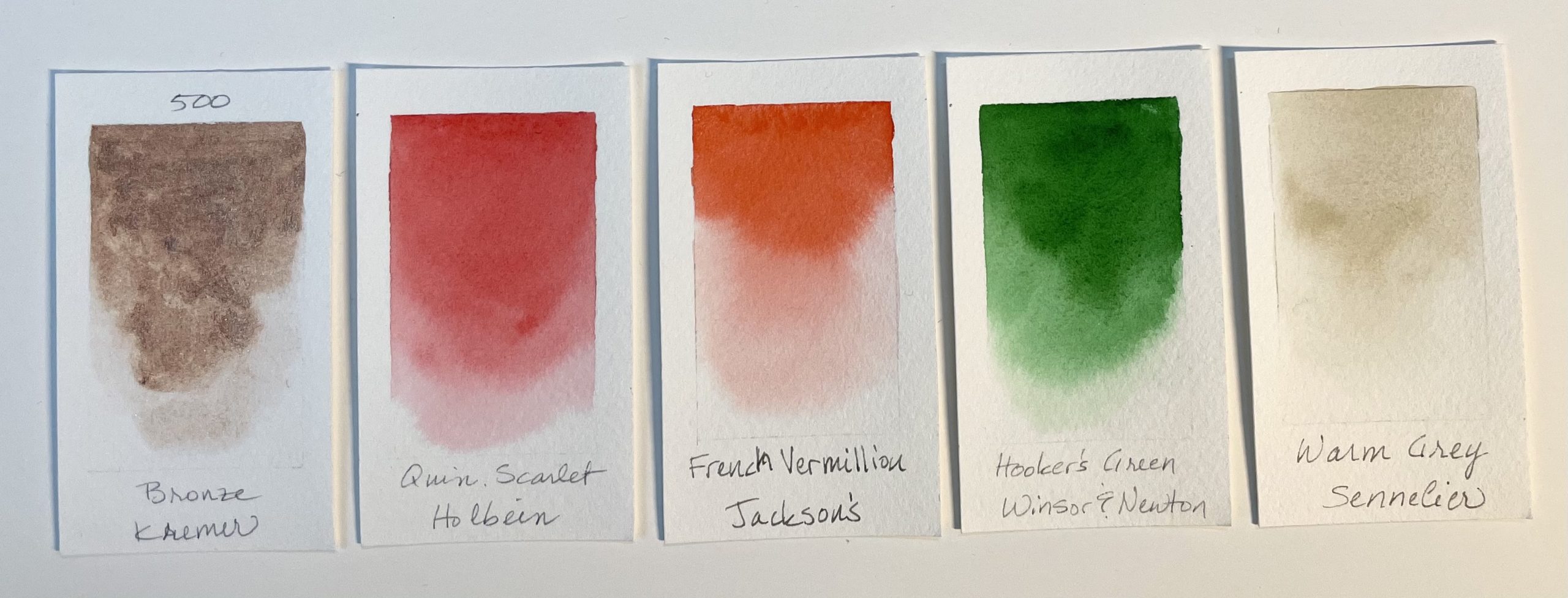
- Bronze, Kremer—a beautiful metallic paint. I didn’t want to lose this one but I don’t use it often, so we’ll see how it goes. It will likely move to an auxiliary palette.
- Quinacridone Scarlet, Holbein—an equivalent of Quinacridone Coral by Daniel Smith. This one tends to be a bit saturated, so I’m trying out the Rose Dore by Winsor and Newton instead.
- French Vermillion, Jackson’s—also used for the peachy undertones. It’s a powerful paint and only a little is needed, which is nice, but it’s a bit much for my needs, especially in the full pan I have. Rose Dore is softer and a bit pinker.
- Hooker’s Green, Winsor and Newton—this color is a bit saturated. I usually used it toned down and with blue added for evergreens or eucalyptus type blue-green hues, but I added other options for this.
- Warm Grey, Sennelier—I like this one, but learned it’s a mix of 4 pigments, so I thought I’d try Buff Titanium for awhile instead, which is a single pigment paint.
The palette is a metal tin I found on AliExpress in a beautiful deep green.
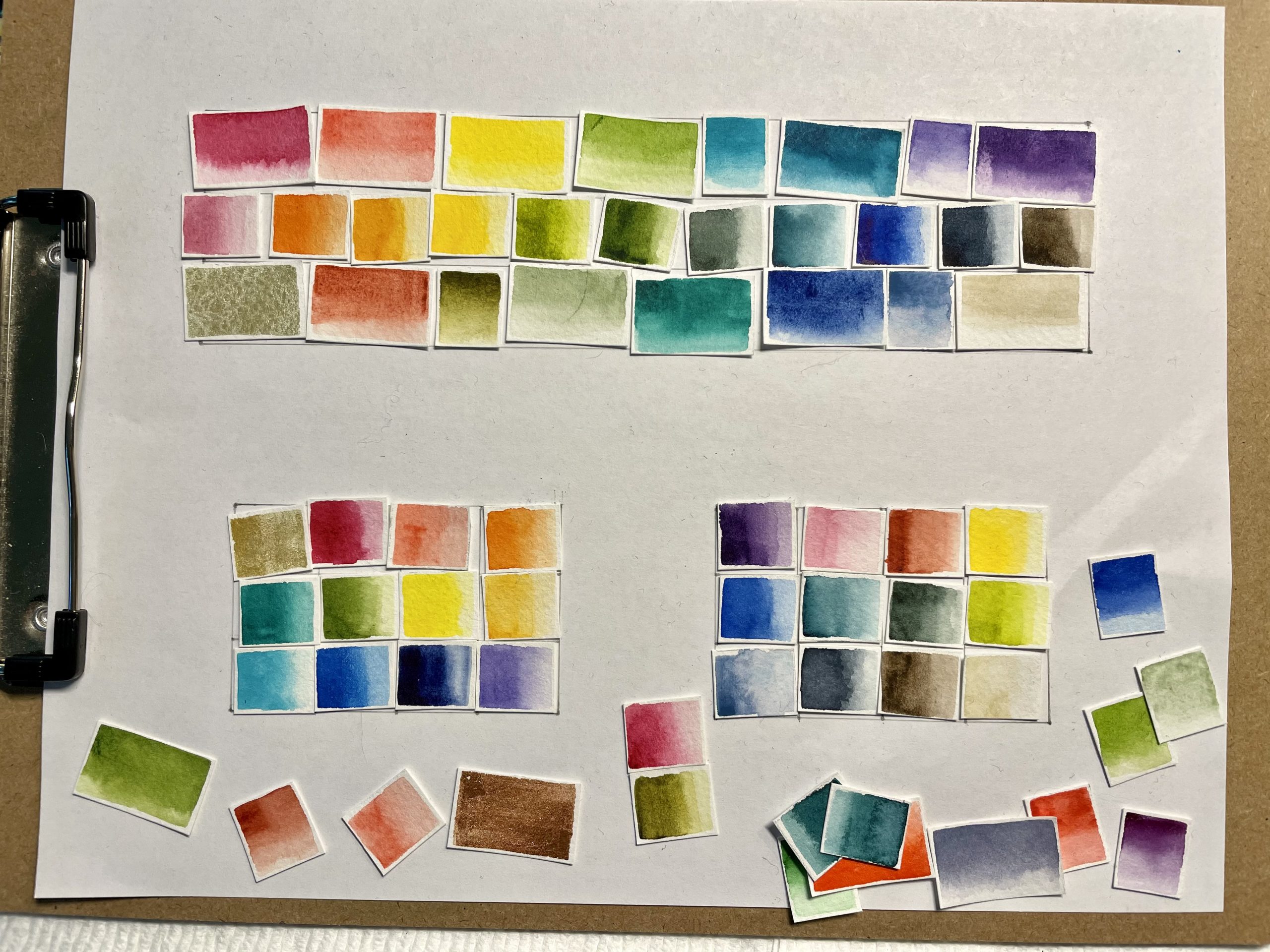
Here is the updated palette with a color chart that fits in the lid.
I also made a reference chart with the name and brand of each paint on the back of the swatch chart.
And that’s it for this round. Check back for posts on my new travel palettes.

Lovely, vibrant pallet! I’ve never heard of Roman. This pallet needs a soundtrack of Spring!
Yes! Roman Szmal is one of my favorites. They’re vibrant, rewet easily, have some unique colors, and are very affordable. You can find them on Jackson’s online shop. :-)
[…] For comparison, my primary palette has more bright, saturated colors. I recently slimmed down my primary palette to fit into another bamboo palette box. I haven’t done a post on the change since it’s not significantly different, but if you’d like more information on the colors, you can view my last primary palette post. […]
hi! I’m wondering what brands and colors you mixed together to make that Spruce Green! It is such a captivating, rich color. Thanks!
Hi Anna! I didn’t record the recipe—likely because I mixed so many things in while I was tweaking it that it didn’t make sense to record it. Fortunately, I just tried it again and found that Phthalo. Green (blue shade) and Perylene Green get very close and then adding a little Phthalo. Turquoise (in my case Aqua Green from Winsor & Newton) got even closer. If you don’t have a Phthalo. Turquoise you could use Phthalo. Blue (green shade), just use less of it. So I would confidently say that’s a good recipe.
I just looked closer at my mixing pics above and it shows Phthalo. Green (Roman Szmal) and Payne’s Gray (Winsor & Newton)—an even more succinct mix. So, you’ve got a few options based on what you might have on hand.