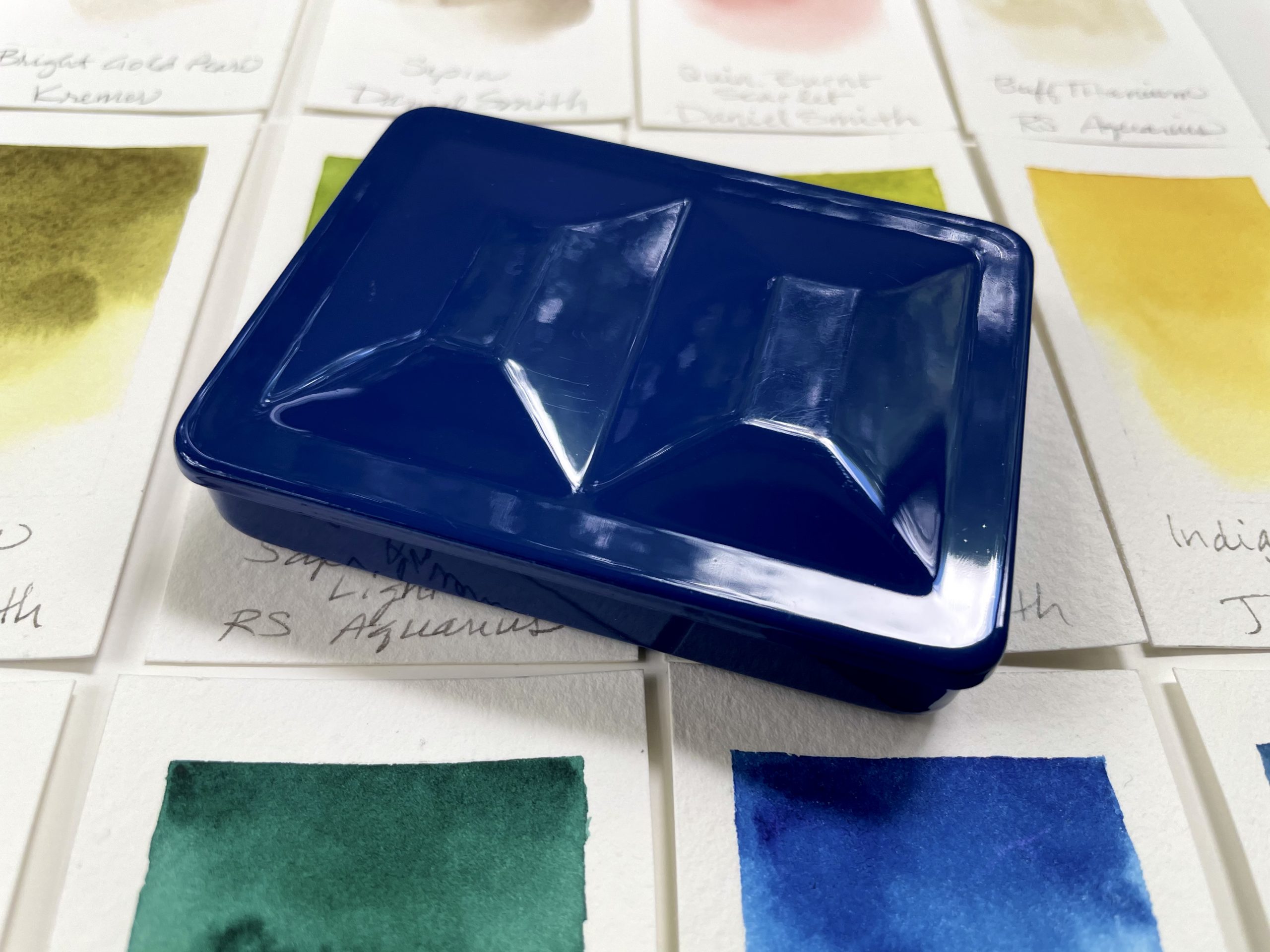
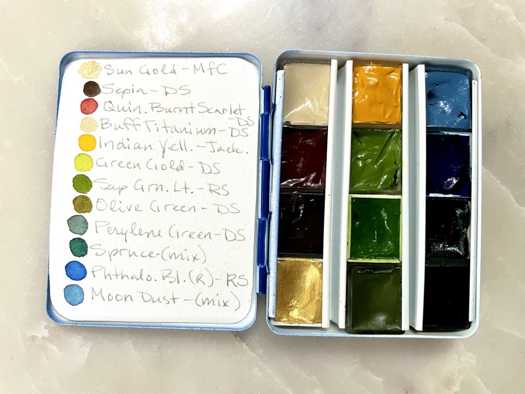
Because I had 2 travel palette boxes, I decided I might have an auxiliary palette for travel with convenience mixes. That way if I want to travel light I can take the primary travel palette, but if I have more space and time I can use the auxiliary palette as well. This means I can travel with 24 of the 27 colors in my main palette.
Most of the colors are either convenience mixes or unique colors I don’t use as often, consisting of the following.
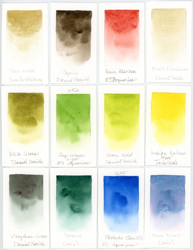
- Sun Gold, Case for Making—I love having a gold in my palette for occasional highlights, stars, a moon, or a touch of ‘fairy dust’
- Warm Sepia, Jackson’s—Sepia is a favorite for a brown I can use as is, add some warmth, or use to tone down warm colors that are a bit bright
- Quinacridone Burnt Scarlet, Daniel Smith—I love having Quinacridone Maroon (Roman Szmal) in my main palette so I got it’s equivalent from Daniel Smith to add in a half pan. I like this earthy, yet vibrant color for it’s peachy undertones. It pairs well with Green Earth and other muted greens and it’s a useful color for toning down saturated warm colors.
- Buff Titanium, Daniel Smith—sometimes I want a soft creamy background or an earthy sandy look, or occasionally create a pastel color and Buff Titanium is great for these situations
- Indian Yellow Hue, Jackson’s—a lovely sunny warm yellow with a smooth texture
- Green Gold, Daniel Smith—I just love the vibrant chartreuse of this Green Gold to match that luminous light green of fresh spring growth in landscapes and botanicals
- Sap Green Light, Roman Szmal Aquarius—this is a new favorite. It doesn’t have the range of Daniel Smith’s Sap Green, but it’s a touch more saturated and I love using it straight out of the pan for fresh grass and leaves
- Olive Green, Daniel Smith—A new addition to my repertoire and a nice earthy contrasting green for variety in landscapes and botanicals that I’m looking forward to using more
- Perylene Green, Daniel Smith—a dark muted green, great for dark or shaded foliage, shadows under branches or used to tone down a saturated green
- Spruce, custom mix—an attempt at mixing my own Prussian Green with lightfast paints. It’s a bit too warm, but still a beautiful color I can add a bit of blue to for distant mountains, eucalyptus, or bluish evergreens
- Phthalo Blue (red shade), Roman Szmal Aquarius—a good staple, mainly for mixing
- Moon Dust, custom mix—a take on the popular PG50 and PV19 mixes but with lightfast paints, Cobalt Turquoise Light and Quin. Rose
I made a swatch card that fits in the lid.
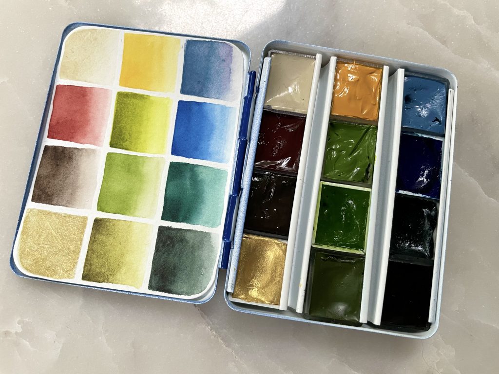
I also added a color and brand reference on the back of the swatch card.
If you haven’t seen it already, you might also be interested in my post on my main travel palette.

[…] Catch the next post for the auxiliary travel palette. […]