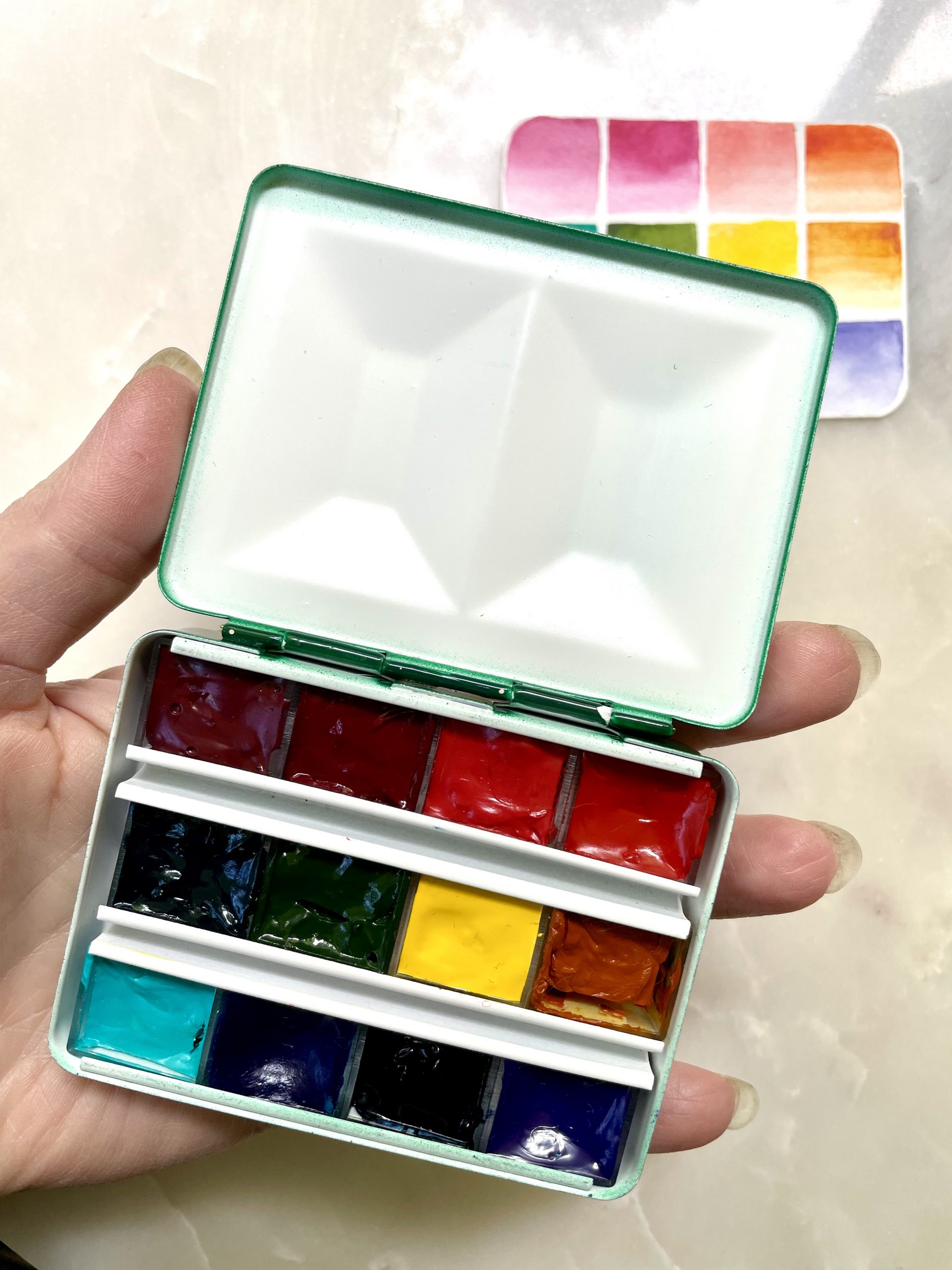
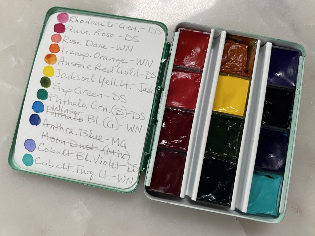
I’ve been planning some travel and decided I might want to have a travel watercolor palette. I had a couple very compact 12-color metal palettes, sometimes called a bijou palette, I got from Case for Making and decided these would be the perfect size. I could use one for a primary set and have an auxiliary one with additional colors and convenience mixes. The palette fits nicely in my hand and has a bit of mixing area.

The color selection includes a reasonable representation of a split primary palette and some additional convenience colors.
- Rhodonite Genuine, Daniel Smith—lovely soft pink with a touch of warmth, great for delicate florals
- Quinacridone Rose, Daniel Smith—the ‘cool red’ of the split primaries and a color I use a lot
- Rose Dore, Winsor and Newton—soft peachy color I tend to use quite a bit in my paintings for sunsets and florals, though this particular paint is new to my collection
- Transparent Orange, Winsor and Newton—my favorite orange, vibrant, but not too vibrant, has a wide value scale, and acts as the ‘warm red’ of the split primaries
- Aussie Red Gold, Daniel Smith—beautiful glowing warm yellow with a strong mass tone, acts as the ‘warm yellow’ of the split primaries
- Jackson’s Yellow Light, Jackson’s—lovely creamy, bright yellow, the ‘cool yellow’ of the split primaries
- Sap Green, Daniel Smith—has great value range and it’s a pleasant, natural green
- Phthalo Green (blue shade), Daniel Smith—I use this often for soft aqua when very diluted and an excellent mixing color for any kind of green or turquoise, as well as for toning down compliments
- Cobalt Turquoise Light, Winsor and Newton—great color for a pop of brightness or interesting granulating and separating mixes
- Winsor Blue (green shade), Winsor and Newton—the ‘cool blue’ of the split primaries, great for mixing deep turquoise or Prussian Blue
- Indanthrene Blue, M Graham—rich, dark blue, leaning toward the warm side. It’s the ‘warm blue’ of the split primaries. Generally, this type of blue is non-granulating, but this one seems to have some texture. I’m used to using Indanthrone Blue by Roman Szmal, but used this one because I can put it in a half pan. We’ll see how it does.
- Cobalt Blue Violet, Daniel Smith—beautiful blue leaning violet with very subtle granulation
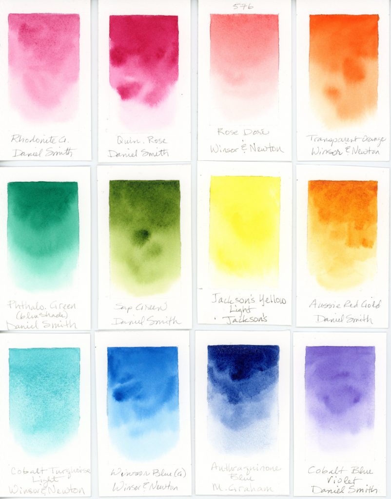
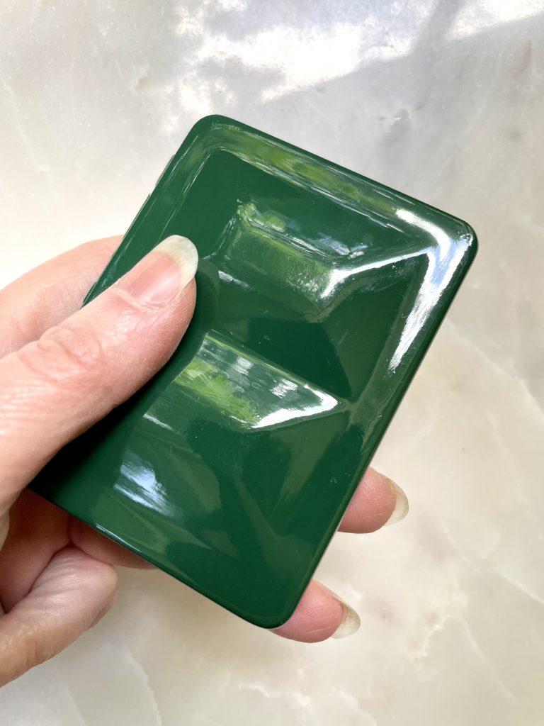
As always, I made a swatch card that fits in the lid.
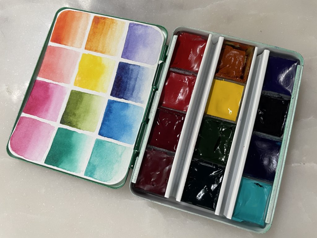
Flip the swatch card over for a color and brand reference.
Catch the next post for the auxiliary travel palette.

[…] If you haven’t seen it already, you might also be interested in my post on my main travel palette. […]
I’ve been a bit a confused about having split primaries in blue.
I have a blue that looks purple because it leans purple so I considered that cool. And a blue that leans green. When watered down, it becomes like a sky blue. When over saturated it looks almost as dark as prussian with a hint of green. The problem for me is that I considered that cool until I started looking into color theory.
I heard someone say green leans yellow, which is warm so, a blue-green is warm. And I’ve heard the opposite which says that yellow is cooler than red so that blue would be cool.
For reference, this blue in question, looks like your indantharene blue and looks similar to your phthalo green (blue it’s more blue than green) as I water it down.
Would you consider a blue (that looks a bit like your phthalo green) cool? Why or why not?
Hello D,
Funny, I’ve had the exact same reaction to the blue variants when it comes to color theory. My natural reaction is that more purplish blues ‘feel’ cool to me and greenish blues ‘feel’ warm. When I imagine the color of arctic ice, I see a neutral or a red leaning blue. When I imagine tropical lagoons, I picture green leaning blues. Yet color theory says the opposite. In color theory, red is considered ‘hot’, therefore reddish (or purplish) blues are therefore warm and green is cool. It’s not a precise model since you can say that any color leans warm or cool in relation to other colors, which makes it subjective in context. Yellow is considered warm, but you can have a warm yellow or a cool yellow. You can have a cool yellow, but compared to green, it is warm. My personal feelings about blues contradict color theory, but I’m happy to abide by the established color theory for the sake of sensible conversations with people :-) I’d love to hear other people’s perspectives on this. Are we the only ones? ..not likely ;-)